In a recent write-up, [David Delony] explains how he built a Wolfram Mathematica-like engine with Python.
Core to the system is SymPy for symbolic math support. [David] said being able to work with symbolic math easily has helped his understanding of calculus and linear algebra. For statistics support he includes NumPy, pandas, and SciPy. NumPy is useful for creating multidimensional arrays and supports basic descriptive statistics such as mean, median, and standard deviation; pandas is a library for operating on tabular data arranged into “DataFrames”, it can load data from spreadsheets (including Excel) and relational databases; and SciPy is a “grab bag” of operations designed for scientific computing, it includes some useful statistics operations, including common probability distributions, such as the binomial, normal, and Student’s t-distribution.
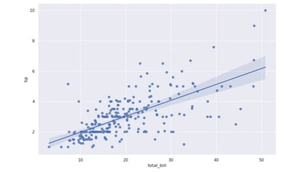
For regression analysis [David] includes statsmodels and Pingouin. If you’re not familiar with the term “regression analysis” it basically refers to the process of curve fitting. When your data is two-dimensional, with one dependent variable, the simple linear regression algorithm will generate a function that fits the data as y = mx + b, including the slope (m) and the y-intercept (b); this can be extrapolated to higher dimensional data and other types of regression.
If you have an interest in symbolic math you might enjoy learning about Mathematica And Wolfram On The Raspberry Pi.