

What’s A Nonius?

If you already know what a nonius is, you can probably skip this post. But, if like us, you would have to look it up, we’ll tell you what we found out. It turns out, a translation mistake taught us a new word and some history we weren’t aware of.
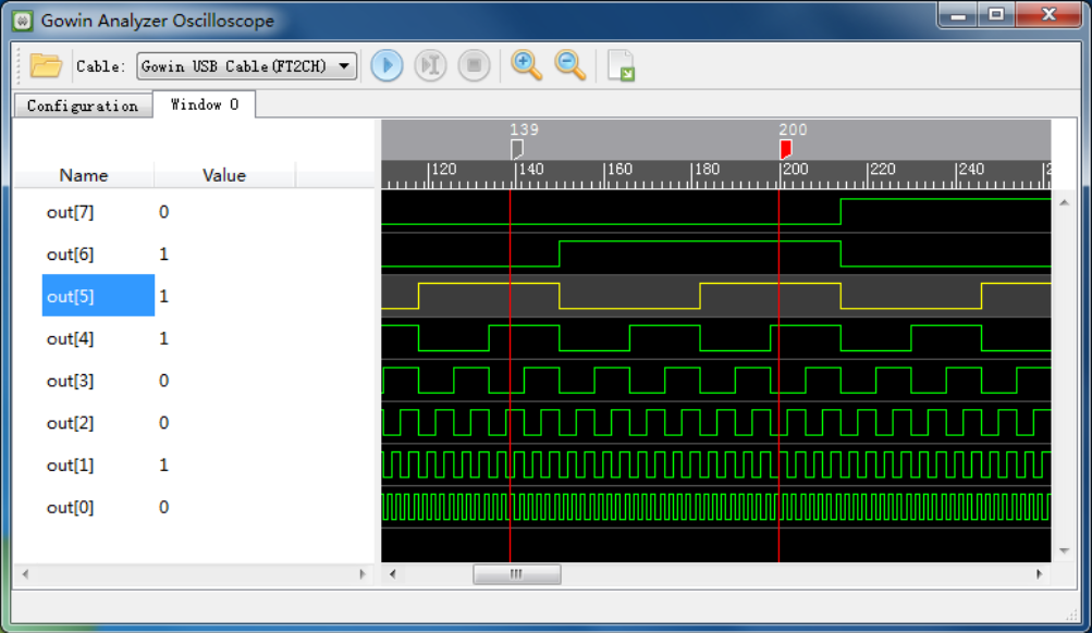
In the manual, this is captioned: Figure 4-7 Nonius Display (Standard Mode)

Have a look at the adjacent graphic from a waveform display. What would you call the vertical red lines at positions 139 and 200?

We’d probably call them markers. Or maybe cursors. The manual, however, calls each one a “nonius”. It refers to them that way multiple times.

Oddly, the manual also has sentences like “Select one nonius and right-click, and then select ‘Remove Marker’ in the next window to delete the nonius.”

So, clearly, a nonius is the vertical line marker or cursor. But that, of course, begs a question…

What is a Nonius?
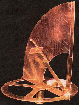
“Nonio originale” by [Henrique Leitão]
Have you ever heard of the vernier scale? If you’ve done navigation, used a traditional caliper, or tuned an old shortwave receiver, you probably have. [Pierre Vernier] developed it in 1631 as a way to better interpolate values on a scale.

However, there was an earlier version used to improve measurements on astrolabes. A Portuguese navigator named [Pedro Nunes] created this type of astrolabe in 1542. The Latinized version of his name is [Petrus Nonius]. What are the odds of him inventing… oh wait, they named it after him. That does make more sense.

The nonius is a series of concentric circles traced on the instrument. Working towards the center, each circle has fewer divisions than the previous one. In fact, if the outer ring had 90 marks for 90 degrees, the next ring would have 89, and the following one would have 88.

Continue reading “What’s A Nonius?” →

Testing Oneself For AI Slop

The feed of a Hackaday writer brings many surprises, some rubbish, and the occasional diamond which of course we bring to you. Sometimes a page catches the eye that’s not a Hackaday piece per se, but makes for interesting reading. Today there was an example which provides a catalyst for a story if not being one itself.

It’s an AI skill intended to make a slop-writing operation look less sloppy, and since it contains a list of slop behaviours, of course it’s irresistible to turn it on yourself. To delve into the archives, if you will. So here goes, how slop-like is your scribe?

It kicks off with the old favourite, “Delve“. Oh dear, that one’s in the List Hackaday corpus quite a bit. Earliest appearance: 2016. Then landscape terms, in which it’s easy to recognise “Sphere” again. Oops. 2016 again. How about “Testament“? Well, that one’s a 2017 word. “Pivotal“? Four years of the Raspberry Pi, back in 2016. How about “Showcase“? Yup, it’s there, in 2019. Meanwhile “Foster“, goes back to 2017.

Next up are “Leverage” and “Utilise“. Safe ground here. Editors have what are referred to a “Pet Peeves”, language tics that annoy them on sight, and those two regrettable pieces of business-speak never evade this red pencil. The word you are looking for is “Use”.

The page goes on to name a load more words as tells, and we could continue to dissect them for your amusement, but we think you get the message from long-pre-LLM Hackaday. It gets more interesting when it talks about paragraph structure, and there are the things we’d recognise as tells. Staccato paragraphs, one-line stacks for impact, and repeated sentence start words. Whether AI slop is sounding like a business influencer’s Linkedin posts, or the other way round, is anybody’s guess. And yes, Hackaday does use em-dashes — get over it.

It’s amusing to poke mild fun at your past writing style, but if there’s a serious point in there it’s that spotting slop is never as easy as having a check-box list of tells when in fact you’re just looking at professional-grade command of the language. After all, given that Hackaday is in its corpus, the LLM can even make a passable effort at writing like one of us. Perhaps the key lies in that article, when the fake Hackaday piece became obvious because it lacked the inference of the real one.

Rendering 3D Prints From G-Code

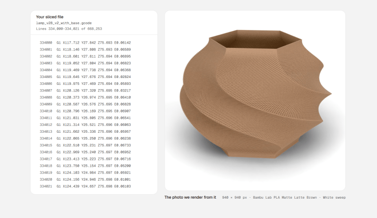
Your CAD software generally has some rudimentary tools for rending images of your parts, from simply-textured models to more photo-realistic options. However, those renders are of the geometry you created—not how that geometry would look after it was sent to a 3D printer. Extrudio is a tool that aims to create more realistic renders for 3D printed parts.

Rather than rendering from the geometry of your model, such as by using an STL file, Extrudio uses G-Code instead. It creates its render based on the instructions your 3D printer uses to produce your part, sweeping a virtual bead of plastic along the toolpaths in the code. In doing so, it can realistically display layer lines in a 3D print and other artifacts of the printing process, like stair-stepping on spheres and curves. It can display the render in various contexts, from blank studio backgrounds to a number of “sets” like a bench or kitchen.

The tool’s website notes that this could be useful for generating images for those selling 3D printed parts online, though obviously the realism of actually printing and photographing a part would still be superior. Still, it could prove a useful tool for quickly pitching realistic images of a 3D printed part, particularly if it’s desirable to model different colors or print techniques without putting in the hours to actually produce them.

We’ve featured some other great 3D printing hacks lately, like this nifty trick for doing overhangs without supports.

Continue reading “Rendering 3D Prints From G-Code” →