Fail of the Week is a recurring Hackaday column that highlights the power of learning from things that simply didn’t work right. Help keep the fun rolling by writing about your past failures and sending us a link to the story — or sending in links to fail write ups you find in your Internet travels.
If you are a regular at creating printed circuit boards, it is likely that somewhere in your shop there will be a discard pile of boards on which you placed a component in the wrong orientation such that it would not work. It’s easily done, and don’t be shy to admit it if it’s happened to you.
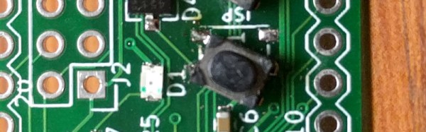
[Bill] was making his own ARM developer board, taking inspiration from the ARM Pro Mini. He produced his PCB design and sent it off to the board house, and in due course received and reflow soldered a batch of beautiful dev boards. On power-up though, something was wrong! No USB device detected on his computer, a disaster. A lot of studying board and schematic led to the discovery that his push-button switches had been placed at 90 degrees to the orientation it should have had, leaving them in a permanently “on” position.
The PCB bug makes this is a Fail Of The Week post, but he transformed into a win with some experimentation with the switch outline in KiCAD before finding a way to mount the switches on the pads at 45 degrees, covering three of the pads. Well done, and well done for admitting the error.
[Editor’s note: been there, done that. One way to prevent the error is to only connect to diagonally opposite pins of the tact switch, so the rotation doesn’t matter.]
Having earlier asked others to come clean with their PCB mistakes, it’s probably appropriate to admit that Hackaday scribes are just as fallible as [Bill] when it comes to PCB layouts. Somewhere there may still be a board on this bench with a QFN microcontroller bodged on at 90 degrees to its original orientation, with cut tracks and tiny wire runs.
Whether you are a seasoned PCB pro or a wet-behind-the-ears rookie, our Creating a PCB In Everything series should be of interest.
It’s not hard to detect meteors: go outside on a clear night in a dark place and you’re bound to see one eventually. But visible light detection is limiting, and knowing that meteors leave a trail of ions means radio detection is possible. That’s what’s behind this attempt to map meteor trails using broadcast signals, which so far hasn’t yielded great results.
Passing jet’s Doppler signature
The fact that meteor trails reflect radio signals is well-known; hams use “meteor bounce” to make long-distance contacts all the time. And using commercial FM broadcast signals to map meteor activity isn’t new, either — we’ve covered the “forward scattering” technique before. The technique requires tuning into a frequency used by a distant station but not a local one and waiting for a passing meteor to bounce the distant signal back to your SDR dongle. Capturing the waterfall display for later analysis should show characteristic patterns and give you an idea of where and when the meteor passed.
[Dave Venne] is an amateur astronomer who turns his eyes and ears to the heavens just to see what he can find. [Dave]’s problem is that the commercial FM band in the Minneapolis area that he calls home is crowded, to say the least. He hit upon the idea of using the National Weather Service weather radio broadcasts at around 160 MHz as a substitute. Sadly, all he managed to capture were passing airplanes with their characteristic Doppler shift; pretty cool in its own right, but not the desired result.
The comments in the RTL-SDR.com post on [Dave]’s attempt had a few ideas on where this went wrong and how to improve it, including the intriguing idea of using 60-meter ham band propagation beacons. Now it’s Hackaday’s turn: any ideas on how to fix [Dave]’s problem? Sound off in the comments below.
Museum exhibits are difficult to make, and they’re always breaking down; especially the interactive ones. This is a combination of budget, building a one-off, and the incredibly harsh abuse they take from children.
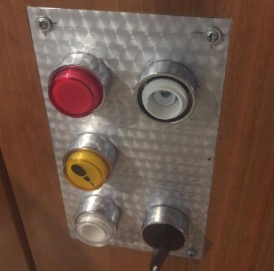
My first exhibit is an interactive laser show that turns waveforms from music into laser patterns, and different types of music have very different patterns. I knew from talking to the museum staff that industrial buttons were a necessity, but it turns out that industrial buttons are made under the assumption that tiny creatures won’t be constantly mashing, twisting, and (ew ew ew) licking the buttons. After a while, the buttons (and poor knob) were trashed.
The button face has been removed, and the knob is spinning freely.
Buttons at toddler level are in a vulnerable position.
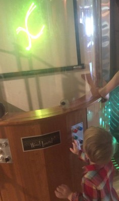
The second exhibit is also interactive, but in this case it’s just a simple button that turns on a thing for a while, then shuts it off. You can read more about the Periodic Table of Motion on the project page. Here I thought; let’s use capacitive touch, put the sensor behind two layers of acrylic for protection, and then there won’t be any moving parts to break. I built a bunch of units, tested it for weeks, then installed it. Instant failure despite my diligence.
Something is different about the installation from my test environment. It might be the second layer of acrylic contributing. Maybe it’s the power supply and a strange ground issue. Maybe the room’s fluorescent lights are creating an electromagnetic field that is interrupting the sensor, or the carpet is causing static buildup that is somehow causing the midichlorians to reverse polarity and discharge through the base plate of prefabulated aluminite. In some of the cells, the button doesn’t work. In other cells it is extremely sensitive. In one column of the table (columns share a common piece of acrylic among 5 cells), a single touch will trigger all 5.
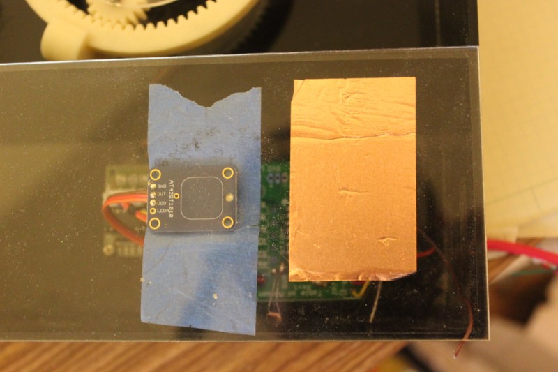
The circuit is an ATtiny with a 2.2M resistor between two pins, one of which connects via a short wire to a soldered connection to a piece of copper tape on the underside of an acrylic piece. The ATtiny is using the capsense library, which has features for automatic recalibration. Because of the way it is installed, I can’t reprogram them to adjust their sensitivity while inside the enclosure, so tweaking them post-install is not an option. I thought I could isolate the problem and use an existing capacitive touch sensor breakout of the AT42QT1010 hooked up to just power, but it had the exact same issue, meaning it’s either the power supply, the enclosure, or the room.
Side-by-side tests of copper tape+Arduino and AT42QT1010 had similar problems.
There are three paths I can go down now:
Find the problem and solve it
Switch to a photoresistor
Petition Hackaday for a better solution
Finding the problem and solving it will be a long and difficult path, especially since the museum environment is somehow and inexplicably different from the test environment. The photoresistor option has promise; when the user puts their hand over the paper button the light level changes. Some early testing indicates that it is easy to detect instantaneous change, and a trailing average and adjusting threshold make it robust enough for changing lighting conditions throughout the day. Further, it’s a simple change to the code, and the existing circuit board will accommodate the adjustment.
As for the third option…
What have you done for child-compatible touch interfaces that are robust enough to handle uncertain environments and harsh abuse? What buttons, knobs, and other interactive elements have you used?
There’s trouble in the Kingdom of Random – the smithies of the realm are having trouble sand-casting copper. And while [King Grant] might not be directly asking for help, we think the Hackaday community might have plenty to say about his efforts.
We’ve all seen plenty of sand casting efforts before, including attempts to make otherwise unobtainable engine parts. And “lost foam” casting, where a model of the part is constructed of polystyrene foam that flashes off when the molten metal is poured, is a relatively new twist on the technique that’s been used to good effect on a recent Gingery lathe build. But most backyard foundries work in aluminum, which is apparently much easier to work with than the copper that [Grant Thompson] is working with. Ironically, his first pour worked the best — not perfect, but at least the islands defining the spokes of his decorative piece didn’t break off and float away as they did in every pour shown in the video below. That leads us to think that the greensand is too dry by the second video. Or perhaps the density of copper just makes it more likely for the sand to float. Maybe a cope and drag mold is in order to keep the islands in place and direct the flow of the copper better.
We know there’s a lot of expertise out there, so sound off in the comments about what you think is going on with these pours.
Has work been a little stressful this week, are things getting you down? Spare a thought for an unnamed sysadmin at the GitHub-alike startup GitLab, who early yesterday performed a deletion task on a PostgreSQL database in response to some problems they were having in the wake of an attack by spammers. Unfortunately due to a command line error he ran the deletion on one of the databases behind the company’s main service, forcing it to be taken down. By the time the deletion was stopped, only 4.5 Gb of the 300 Gb trove of data remained.
Reading their log of the incident the scale of the disaster unfolds, and we can’t help wincing at the phrase “out of 5 backup/replication techniques deployed none are working reliably or set up in the first place“. In the end they were able to restore most of the data from a staging server, but at the cost of a lost six hours of issues and merge requests. Fortunately for them their git repositories were not affected.
For 707 GitLab users then there has been a small amount of lost data, the entire web service was down for a while, and the incident has gained them more publicity in a day than their marketing department could have achieved in a year. The post-mortem document makes for a fascinating read, and will probably leave more than one reader nervously thinking about the integrity of whichever services they are responsible for. We have to hand it to them for being so open about it all and for admitting a failure of their whole company for its backup failures rather than heaping blame on one employee. In many companies it would all have been swept under the carpet. We suspect that GitLab’s data will be shepherded with much more care henceforth.
We trust an increasing amount of our assets to online providers these days, and this tale highlights some of the hazards inherent in placing absolute trust in them. GitLab had moved from a cloud provider to their own data centre, though whether or not this incident would have been any less harmful wherever it was hosted is up for debate. Perhaps it’s a timely reminder to us all: keep your own backups, and most importantly: test them to ensure they work.
There’s a reason we often use the phrase “It ain’t Rocket Science”. Because real rocket science IS difficult. It is dangerous and complicated, and a lot of things can and do go wrong, often with disastrous consequences. It is imperative that the lessons learned from past failures must be documented and disseminated to prevent future mishaps. This is much easier said than done. There’s a large number of agencies and laboratories working on multiple projects over long periods of time. Which is why NASA has set up NASA Lessons Learned — a central, online database of issues documented by contributors from within NASA as well as other organizations.
Unfortunately, all of this body of past knowledge is sometimes still not enough to prevent problems. Case in point is a recently discovered issue on the ISS — a completely avoidable power supply mistake. Science payloads attach to the ISS via holders called the ExPRESS logistics carriers. These provide mechanical anchoring, electrical power and data links. Inside the carriers, the power supply meant to supply 28V to the payloads was found to have a few capacitors mounted the other way around. This has forced the payloads to use the 120V supply instead, requiring them to have an additional 120V to 28V converter retrofit. This means modifying the existing hardware and factoring in additional weight, volume, heat, cost and other issues when adding the extra converter. If you’d like to dig into the details, check out this article about NASA’s power supply fail.
Have you ever wired up a piece of test equipment to a circuit or piece of equipment on your bench, only to have the dreaded magic smoke emerge when you apply power? [Steaky] did, and unfortunately for him the smoke was coming not from his circuit being tested but from a £2300 Clare H101 HiPot tester. His write-up details his search for the culprit, then looks at how the manufacturer might have protected the instrument.
[Steaky]’s employer uses the HiPot tester to check that adjacent circuits are adequately isolated from each other. A high voltage is put between the two circuits, and the leakage current between them is measured. A variety of tests are conducted on the same piece of equipment, and the task in hand was to produce a new version of a switch box with software control to swap between the different tests.
This particular instrument has a guard circuit, a pair of contacts that have to be closed before it will proceed. So the switch box incorporated a relay to close them, and wiring was made to connect to the guard socket. At first it was thought that the circuit might run at mains voltage, but when it was discovered to be only 5V the decision was made to use a 3.5mm jack on the switch box. Inadvertently this was left with its sleeve earthed, which had the effect of shorting out a DC to DC converter in the HiPot tester and releasing the smoke. Fortunately then the converter could be replaced and the machine brought back to life, but it left questions about the design of the internal circuit. What was in effect a logic level sense line was in fact connected to a low current power supply, and even the most rudimentary of protection circuitry could have saved the day.
We all stand warned to be vigilant for this kind of problem, and kudos to [Steaky] for both owning up to this particular fail and writing such a good analysis of it.
Fail of the Week is a Hackaday column which celebrates failure as a learning tool. Help keep the fun rolling by writing about your own failures and sending us a link to the story -- or sending in links to fail write ups you find in your Internet travels.


 Fail of the Week is a Hackaday column which celebrates failure as a learning tool. Help keep the fun rolling by writing about your own failures and