Split-Flap Clock Flutters Its Way To Displaying Time Without Numbers

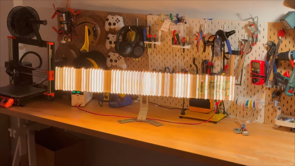
Here’s a design for a split-flap clock that doesn’t do it the usual way. Instead of the flaps showing numbers , Klapklok has a bit more in common with flip-dot displays.

Klapklok updates every 2.5 minutes.

It’s an art piece that uses custom-made split-flaps which flutter away to update the display as time passes. An array of vertically-mounted flaps creates a sort of low-res display, emulating an analog clock. These are no ordinary actuators, either. The visual contrast and cleanliness of the mechanism is fantastic, and the sound they make is less of a chatter and more of a whisper.

The sound the flaps create and the sight of the high-contrast flaps in motion are intended to be a relaxing and calming way to connect with the concept of time passing. There’s some interactivity built in as well, as the Klapklok also allows one to simply draw on it wirelessly with via a mobile phone.

Klapklok has a total of 69 elements which are all handmade. We imagine there was really no other way to get exactly what the designer had in mind; something many of us can relate to.

Split-flap mechanisms are wonderful for a number of reasons, and if you’re considering making your own be sure to check out this easy and modular DIY reference design before you go about re-inventing the wheel. On the other hand, if you do wish to get clever about actuators maybe check out this flexible PCB that is also its own actuator.

Continue reading “Split-Flap Clock Flutters Its Way To Displaying Time Without Numbers”

What’s The Deal With AI Art?

A couple weeks ago, we had a kerfuffle here on Hackaday: A writer put out a piece with AI-generated headline art. It was, honestly, pretty good, but it was also subject to all of the usual horrors that get generated along the way. If you have played around with any of the image generators you know the AI-art uncanny style, where it looks good enough at first glance, but then you notice limbs in the wrong place if you look hard enough. We replaced it shortly after an editor noticed.

The story is that the writer couldn’t find any nice visuals to go with the blog post, with was about encoding data in QR codes and printing them out for storage. This is a problem we have frequently here, actually. When people write up a code hack, for instance, there’s usually just no good image to go along with it. Our writers have to get creative. In this case, he tossed it off to Stable Diffusion.

Some commenters were afraid that this meant that we were outsourcing work from our fantastic, and very human, art director Joe Kim, whose trademark style you’ve seen on many of our longer-form original articles. Of course we’re not! He’s a genius, and when we tell him we need some art about topics ranging from refining cobalt to Wimshurst machines to generate static electricity, he comes through. I think that all of us probably have wanted to make a poster out of one or more of his headline art pieces. Joe is a treasure.

But for our daily blog posts, which cover your works, we usually just use a picture of the project. We can’t ask Joe to make ten pieces of art per day, and we never have. At least as far as Hackaday is concerned, AI-generated art is just as good as finding some cleared-for-use clip art out there, right?

Except it’s not. There is a lot of uncertainty about the data that the algorithms are trained on, whether the copyright of the original artists was respected or needed to be, ethically or legally. Some people even worry that the whole thing is going to bring about the end of Art. (They worried about this at the introduction of the camera as well.) But then there’s also the extra limbs, and AI-generated art’s cliche styles, which we fear will get old and boring after we’re all saturated with them.

So we’re not using AI-generated art as a policy for now, but that’s not to say that we don’t see both the benefits and the risks. We’re not Luddites, after all, but we are also in favor of artists getting paid for their work, and of respect for the commons when people copyleft license their images. We’re very interested to see how this all plays out in the future, but for now, we’re sitting on the sidelines. Sorry if that means more headlines with colorful code!

Ultra-Black Material, Sustainably Made From Wood

Researchers at the University of British Columbia leveraged an unusual discovery into ultra-black material made from wood. The deep, dark black is not the result of any sort of dye or surface coating; it’s structural change to the wood itself that causes it to swallow up at least 99% of incoming light.

One of a number of prototypes for watch faces and jewelry.

The discovery was partially accidental, as researchers happened upon it while looking at using high-energy plasma etching to machine the surface of wood in order to improve it’s water resistance. In the process of doing so, they discovered that with the right process applied to the right thickness and orientation of wood grain, the plasma treatment resulted in a surprisingly dark end result. Fresh from the plasma chamber, a wood sample has a thin coating of white powder that, once removed, reveals an ultra-black surface.

The resulting material has been dubbed Nxylon (the name comes from mashing together Nyx, the Greek goddess of darkness, with xylon the Greek word for wood) and has been prototyped into watch faces and jewelry. It’s made from natural materials, the treatment doesn’t create or involve nasty waste, and it’s an economical process. For more information, check out UBC’s press release.

You have probably heard about Vantablack (and how you can’t buy any) and artist Stuart Semple’s ongoing efforts at making ever-darker and accessible black paint. Blacker than black has applications in optical instruments and is a compelling thing in the art world. It’s also very unusual to see an ultra-black anything that isn’t the result of a pigment or surface coating.

AI Image Generator Twists In Response To MIDI Dials, In Real-time

MIDI isn’t just about music, as [Johannes Stelzer] shows by using dials to adjust AI-generated imagery in real-time. The results are wild, with an interactivity to them that we don’t normally see in such things.

[Johannes] uses Stable Diffusion‘s SDXL Turbo to create a baseline image of “photo of a red brick house, blue sky”. The hardware dials act as manual controls for applying different embeddings to this baseline, such as “coral”, “moss”, “fire”, “ice”, “sand”, “rusty steel” and “cookie”.

By adjusting the dials, those embeddings are applied to the base image in varying strengths. The results are generated on the fly and are pretty neat to see, especially since there is no appreciable amount of processing time required.

The MIDI controller is integrated with the help of lunar_tools, a software toolkit on GitHub to facilitate creating interactive exhibits. As for the image end of things, we’ve previously covered how AI image generators work.

George Washington Gets Cleaned Up With A Laser

Now, we wouldn’t necessarily call ourselves connoisseurs of fine art here at Hackaday. But we do enjoy watching [Julian Baumgartner]’s YouTube channel, where he documents the projects that he takes on as a professional conservator. Folks send in their dirty or damaged paintings, [Julian] works his magic, and the end result often looks like a completely different piece. Spoilers: if you’ve ever looked at an old painting and wondered why the artist made it so dark and dreary — it probably just needs to be cleaned.

Anyway, in his most recent video, [Julian] pulled out a piece of gear that we didn’t expect to see unleashed against a painting of one of America’s Founding Fathers: a Er:YAG laser. Even better, instead of some fancy-pants fine art restoration laser, he apparently picked up second hand unit designed for cosmetic applications. The model appears to be a Laserscope Venus from the early 2000s, which goes for about $5K these days.

Now, to explain why he raided an esthetician’s closet to fix up this particular painting, we’ve got to rewind a bit. As we’ve learned from [Julian]’s previous videos, the problem with an old dirty painting is rarely the paining itself, it’s the varnish that has been applied to it. These varnishes, especially older ones, have a tendency to yellow and crack with age. Now stack a few decades worth of smoke and dirt on top of it, and you’ve all but completely obscured the original painting underneath. But there’s good news — if you know what you’re doing, you can remove the varnish without damaging the painting itself.

In most cases, this can be done with various solvents that [Julian] mixes up after testing them out on some inconspicuous corner of the painting. But in this particular case, the varnish wasn’t reacting well to anything in his inventory. Even his weakest solvents were going right through it and damaging the paint underneath.

Because of this, [Julian] had to break out the big guns. After experimenting with the power level and pulse duration of the 2940 nm laser, he found the settings necessary to break down the varnish while stopping short of cooking the paint it was covering. After hitting it with a few pulses, he could then come in with a cotton swab and wipe the residue away. It was still slow going, but it turns out most things are in the art conservation world.

This isn’t the first time we’ve covered [Julian]’s resourceful conservation methods. Back in 2019, we took at look the surprisingly in-depth video he created about the design and construction of his custom heat table for flattening out large canvases.

Continue reading “George Washington Gets Cleaned Up With A Laser”

An image of a grey plastic carrying case, approximately the size of an A5 notebook. Inside are darker grey felt lined cubbies with a mirror, piece of glass, a viewfinder, and various small printed parts to assemble a camera lucida.

Camera Lucida – Drawing Better Like It’s 1807

As the debate rages on about the value of AI-generated art, [Chris Borge] printed his own version of another technology that’s been the subject of debate about what constitutes real art. Meet the camera lucida.

Developed in the early part of the nineteenth century by [William Hyde Wollaston], the camera lucida is a seemingly simple device. Using a prism or a mirror and piece of glass, it allows a person to see the world overlaid onto their drawing surface. This moves details like proportions and shading directly to the paper instead of requiring an intermediary step in the artist’s memory. Of course, nothing is a substitute for practice and skill. [Professor Pablo Garcia] relates a story in the video about how [Henry Fox Talbot] was unsatisfied with his drawings made using the device, and how this experience was instrumental in his later photographic experiments.

[Borge]’s own contribution to the camera lucida is a portable version that you can print yourself and assemble for about $20. Featuring a snazzy case that holds all the components nice and snug on laser cut felt, he wanted a version that could go in the field and not require a table. The case also acts as a stand for the camera to sit at an appropriate height so he can sketch landscapes in his lap while out and about.

Interested in more drawing-related hacks? How about this sand drawing bot or some Truly Terrible Dimensioned Drawings?

Continue reading “Camera Lucida – Drawing Better Like It’s 1807”

Stepping Inside Art In VR, And The Workflow Behind It

The process of creating something is always chock-full of things to learn, so it’s always a treat when someone takes the time and effort to share it. [Teadrinker] recently published the technique and workflow behind bringing art into VR, which explains exactly how they created a virtual reality art gallery that allows one to step inside paintings, called Art Plunge (free on Steam.)

Extending a painting’s content to fill in the environment is best done by using other works by the same artist.

It walks through not just how to obtain high-resolution images of paintings, but also discusses how to address things like adjusting the dynamic range and color grading to better match the intended VR experience. There is little that is objectively correct in technical terms when it comes to the aesthetic presentation details like brightness and lighting, so guidance on what does and doesn’t work well and how to tailor to the VR experience is useful information.

One thing that is also intriguing is the attention paid to creating a sense of awe for viewers. The quality, the presentation, and even choosing sounds are all important for creating something that not only creates a sense of awe, but does so in a way that preserves and cultivates a relationship between the art and the viewer that strives to stay true to the original. Giving a viewer a sense of presence, after all, can be more than just presenting stereoscopic 3D images or fancy lightfields.

You can get a brief overview of the process in a video below, but if you have the time, we really do recommend reading the whole breakdown.

Continue reading “Stepping Inside Art In VR, And The Workflow Behind It”