Here’s a neat little trick: take the jaggies out of scaled fonts on the fly! This technique is for use on graphic displays where you might want to scale your fonts up. Normally you’d just write a 2×2 block of pixels for every area where there would have been one pixel and boom, larger font. Problem is, that also multiplies each empty area and you end up with jagged edges in the transitions that really catch your eye.
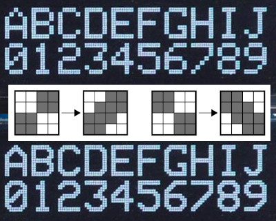 [David Johnson-Davies] entered big-brain mode and did something much cleverer than the obvious solution of using multiple font files. Turns out if you analyze the smoothing problem you’ll realize that it’s only the angled areas that are to blame, horizontal and vertical scaling are nice and smooth. [David’s] fix looks for checker patterns in what’s being drawn, adding a single pixel in the blank spots to smooth out the edge incredibly well!
The technique has been packaged up in a simple function that [David] wrote to play nicely in the Arduino ecosystem. However, the routine is straightforward and would be quick to implement no matter the language or controller. Keep this one in your back pocket!
Now if all you have on hand is an HD44780 character LCD, that one’s arguably even more fun to hack around on just because you’re so limited on going beyond the hard-coded font set. We’ve seen amazing things like using the custom character slots to play Tetris.


