parser drill

Machining Wood Inlays, No CNC Required

It’s almost hard to remember a time when the obvious answer to most questions about manufacturing wasn’t “Throw it on the CNC.” CNC machines have become so entrenched that the acronym has become a verb; few people would misunderstand a statement like “Let’s just CNC that.”

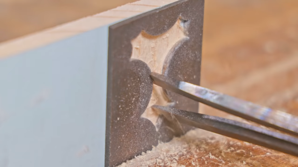
But before CNC machines became so ubiquitous, there were plenty of clever tricks for cutting material in a controlled fashion, as [Pask] shows us with this tool to machine wood for inlays. The tool is called a parser (or passer) drill, and is designed for use in conjunction with a steel template. [Pask]’s version seems pretty easy to make; a pair of mild steel bars are forged flat into spade shapes before having a cutting surface ground into them. The two halves of the drill are welded together and ground down to fit in the chuck of a hand drill, a modern nod to the fact that few people will want to use the traditional bow and breastplate that drove the original parser drills.

In use, a steel template that determines the shape of the inlay is affixed to the workpiece. The cutting edges of the bits are plunged into the template cutout to machine out the wood; the overhangs of the bits act as depth stop and guide. It only takes a few seconds to make a neat, CNC-free inlay. The video below shows the tool being made and in action.

It’s nice to see what can be accomplished without the need for fancy CNC machines. Not that we have anything against them, of course, but when the same results can be had with some scraps of steel and a little ingenuity, it’s pretty impressive. Looking for something between manual tools and CNC for woodworking? The pantorouter might be just your speed.

Continue reading “Machining Wood Inlays, No CNC Required”

How To Design A Custom Generator Interlock Plate

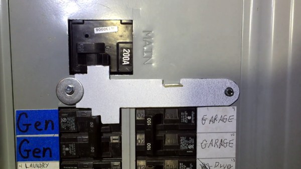
If you connect a generator to your home’s main electrical panel when the power goes out, you need to make sure the main breaker is shut off. Otherwise, when the power comes back on, you (or the linemen) are going to have a bad time. There are commercial interlock plates which physically prevent the generator and main breakers from being switched on at the same time, but since they tend to be expensive, [HowToLou] decided to make one himself.

The hardest part of this project is designing the template. It needs to be carefully shaped so its resting position prevents the generator’s breaker from being switched on under normal circumstances, but once the main is turned off and out of the way, you should be able to lift it up and have the clearance to flip the lower breaker. Spending some quality time at the breaker box with tape and a few pieces of cardboard is going to be the easiest way of finding the proper shape.

Continue reading “How To Design A Custom Generator Interlock Plate”

Making Your Own Chain Sprockets, The Tidy Way

Chain sprockets are a key drivetrain component in a lot of builds. Unfortunately they can be difficult to source, particularly for those outside the reach of retailers like McMaster-Carr. In such situations, you might consider making your own.

The toothed profile on a chain sprocket can be produced in a simple manner by drawing a base circle, along with a series of circles spaced appropriately for the chain in question. This involves measuring the pitch and roller diameter of the chain. With these measurements in hand, a template can be created to produce the sprocket.

From there a series of holes are drilled to rough out the basic shape of the teeth, before the sprocket is then cut down to its appropriate outer diameter. The finishing work consists of chamfering the sprocket’s thickness, as well as the filing the sharp edges of the teeth for smooth engagement.

It’s a quick and easy method for producing sprockets with well-defined, accurate profiles. We’ve featured other rough and ready methods before, too. Video after the break.

Continue reading “Making Your Own Chain Sprockets, The Tidy Way”

CNC’ed Business Card

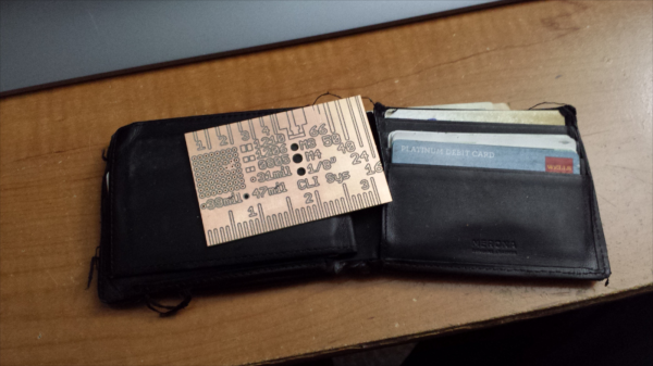
Hobby CNC mills have made rapid prototyping easier and faster for hackers. One really useful application is quickly fabricating your own milled PCB’s. [proto logical] built a Reference PCB Business Card using his CNC mill after repeatedly coming across other hackers who were not too convinced about the capabilities of CNC mills in routing PCB’s (also referred to as isolation milling). He thought of making a business card sized reference PCB to show around when he bumps into such folks.

To keep it useful, he included inch and centimetre scales, 0.1″ grid of holes, reference track widths from 16 mil to 66 mil, a few common drill holes and vias and some SMD foot prints. The single sided board is 50 mil thick, so it doesn’t bulk up his wallet. He’s posted the Eagle board file (direct download) and G-code (text file) for those interested in milling their own reference boards. The idea isn’t new – it’s been tried several times in different form factors in the past, generally using more traditional techniques. [proto logical] got inspiration from [Rohit Gupta’s] TinkerRule – The Maker’s Swiss Army Knife. Then there’s the very popular uRuler made by [Dave Jones] of EEVBlog fame. If you have any suggestions on improving the design, chime in with comments here.

Thanks to [ACG] for sending in this tip that he dug up while looking for CNC routed PCB’s.

Hackaday Printing Press Upgrade

There comes a time when your movable type becomes so over-used that you no longer get a legible print off of the printing press. For months now we’ve been at work on a new site design that maintains the essence of Hackaday while ejecting the 10-year-old dregs of the site. With each small success we’ve actually ruined ourselves on viewing the old design. It is with great relief that we unveil a site design built specifically for Hackaday’s needs.

The most notable change is in the content of our landing page. For ten years, loading Hackaday.com resulted in the most recent blog posts. The blog concept is proven, but provides little opportunity to highlight quality original content and information about upcoming events. We have tried the use of “sticky” posts but honestly I find them somewhat annoying. The solution to this is not immediately apparent, but I feel we have found the most efficient solution to our complex set of needs..

We have a lot of community members who participate in Hackaday in numerous ways. Changes found in this design are driven by that fact. The landing page will, from this point forward, be a somewhat more persistent collection of notable content from the blog, our community site (hackaday.io), as well as news regarding live events, store features, contest highlights, and more. Those hard-core fans — a label I also assign to myself — will find the same reading experience as always on the new blog URL: hackaday.com/blog.

Aesthetically, we hope that all will agree the new design far supersedes the old. There was a lot to fix, and the work of the Hackaday crew who designed and implemented this new interface is truly amazing. I hope you will take the time to leave a positive comment about their work. As with any major transition, there will be some bumps in the road. Right now most of our sidebar widgets have not been migrated but that and any other problems will be fixed soon.

In this design we strived to highlight the title and image of each post to immediately convey the core concepts of the projects shown here. The author by-line and comment count remain core to the presentation of the articles, and our link style continues to be immediately apparent in the body of each article. I think we have far surpassed the readability of the comments section, in addition to the content itself. We knew we could rebuilt it… we have the technology… long live articles worth reading.

UPDATE: We are working very hard to fix all the parts that don’t look quite right. Thanks for your patience!

UPDATE 2: Infinite scrolling isn’t a feature, it’s a regression. On our test server all the blog listings were paginated just like always. When our host, WordPress VIP, pushed live the infinite scrolling manifested itself. We’ve filed a ticket with them and are hoping for a solution shortly.

UPDATE 3: Infinite scrolling has now been fixed and the blog layout now paginates. The mouse-over zoom effect has been removed. Slideshow speed has been adjusted and if you hover you mouse over a feature it will pause the scrolling.

The New Template Has Arrived!

When we decided that our template needed a remake several years ago, we knew it was going to be a long and difficult process. We offered you a chance to give us some input in a recent post and now we are releasing the first iteration of the new template.

For those that saw the mockups and gave us your opinion, you will be happy to see we actually listened to many thoughts and incorporated them in our final design.  We worked with some people at Google to determine what features should be tossed and what to keep, and what we have ended up with, is what you see. We also acknowledge that not everyone will love the change, but we feel it is a move in the right direction. We’re really happy how it has ended up.

I want to offer a special thanks to [Stephanie Froehner] who put tons of time into making this template pretty, even if it has been hacked and slashed a bit since then.

Join me after the break for an explanation of some of the new features and upcoming features.

Continue reading “The New Template Has Arrived!”