Ask Hackaday: Has Firefox Finally Gone Too Far?

In a world where so much of our lives depend on the use of online services, the web browser used to access those services becomes of crucial importance. It becomes a question of whether we trust the huge corporate interests which control this software with such access to our daily lives, and it is vital that the browser world remains a playing field with many players in the game.

The mantle has traditionally fallen upon Mozilla’s Firefox browser to represent freedom from corporate ownership, but over the last couple of years even they have edged away from their open source ethos and morphed into an advertising company that happens to have a browser. We’re asking you: can we still trust Mozilla’s Firefox, when the latest version turns on ad measurement by default?

Such has been the dominance of Google’s Chromium in the browser world, that it becomes difficult to find alternatives which aren’t based on it. We can see the attraction for developers, instead of pursuing the extremely hard task of developing a new browser engine, just use one off-the-shelf upon which someone else has already done the work. As a result, once you have discounted browsers such as the venerable Netsurf or Dillo which are cool as heck but relatively useless for modern websites, the choices quickly descend into the esoteric. There are Ladybird and Servo which are both promising but still too rough around the edges for everyday use, so what’s left? Probably LibreWolf represents the best option, a version of Firefox with a focus on privacy and security.

We’re interested in your views on this topic, because we know you’ll have a lot to say about it. Meanwhile if you’re a Firefox user who’s upgraded to version 128 and you’re not sure what to do, don’t panic. Find the settings page, go to “Privacy and Security”, and un-check the “Website Advertising Preferences” checkbox.

The Minimalistic Dillo Web Browser Is Back

Over the decades web browsers have changed from the fairly lightweight and nimble HTML document viewers of the 1990s to today’s top-heavy browsers that struggle to run on a system with less than a quad-core, multi-GHz CPU and gigabytes of RAM. All but a few, that is.

Dillo is one of a small number of browsers that requires only a minimum of system resources and will happily run on an Intel 486 or thereabouts. Sadly, the project more or less ended back in 2016 when the rendering engine’s developer passed away, but with the recent 3.10 release the project seems to be back on track, courtesy of efforts by [Rodrigo Arias Mallo].

Although a number of forks were started after the Dillo project ground to a halt, of these only Dillo+ appears to be active at this point in time, making this project revival a welcome boost, as is its porting to Atari systems. As for Dillo’s feature set, it boasts support for a range of protocols, including Gopher, HTTP(S), Gemini, and FTP via extensions. It supports HTML 4.01 and some HTML 5, along with CSS 2.1 and some CSS 3 features, and of course no JavaScript.

On today’s JS-crazed web this means access can be somewhat limited, but maybe it will promote websites to have a no-JS fallback for the Dillo users. The source code and releases can be obtained from the GitHub project page, with contributions to the project gracefully accepted.

Thanks to [Prof. Dr. Feinfinger] for the tip.

The Modern WWW, Or: Where Do We Want To Go From Here?

From the early days of ARPANET until the dawn of the World Wide Web (WWW), the internet was primarily the domain of researchers, teachers and students, with hobbyists running their own BBS servers you could dial into, yet not connected to the internet. Pitched in 1989 by Tim Berners-Lee while working at CERN, the WWW was intended as an information management system that’d provide standardized access to information using HTTP as the transfer protocol and HTML and later CSS to create formatted documents inspired by the SGML standard. Even better, it allowed for WWW forums and personal websites to begin to pop up, enabling the eternal joy of web rings, animated GIFs and forums on any conceivable topic.

During the early 90s, as the newly opened WWW began to gain traction with the public, the Mosaic browser formed the backbone of the WWW browsers (‘web browsers’) of the time, including Internet Explorer – which licensed the Mosaic code – and the Mosaic-based Netscape Navigator. With the WWW standards set by the – Berners-Lee-founded – World Wide Web Consortium (W3C), the stage appeared to be set for an open and fair playing field for all. What we got instead was the brawl referred to as the ‘browser wars‘, which – although changed – continues to this day.

Today it isn’t Microsoft’s Internet Explorer that’s ruling the WWW while setting the course for new web standards, but instead we have Google’s Chrome browser partying like it’s the early 2000s and it’s wearing an IE mask. With former competitors like Opera and Microsoft having switched to the Chromium browser engine that underlies Chrome, what does this tell us about the chances for alternative browsers and the future of the WWW?

Continue reading “The Modern WWW, Or: Where Do We Want To Go From Here?”

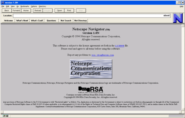
Netscape Navigator 1.0

So, Why Are Hyperlinks Blue, Anyway?

You’ve no doubt noticed by now that while some links are gold and/or bold, most links out there are blue, especially on web pages of yore. But why? the TL;DR answer is that the Mosaic browser, released in early 1993 used blue links, and since the browser was widely distributed, blue just became the norm. Okay, fine. But why did they choose blue? That’s a question that requires a deep dive into technology through the ages as the Web and personal computing developed in tandem.

It’s important to remember that the idea of hyperlinks predates the invention of color monitors, which thickens the plot a bit. But the pivotal point seems to be Windows 3.1, released April 6th, 1992, when hyperlink blue becomes a navigational and interactive color. A year later, the April 12, 1993 release notes for Mosaic include a bullet that becomes the point of origin for blue hyperlinks:

Changed default anchor representations: blue and single solid underline for unvisited, dark purple and single dashed underline for visited.Mosaic release notes

Around the same time, the Cello browser was developed at Cornell Law, which also used blue hyperlinks. So the blue hyperlink concept was arguably browser-agnostic even before Netscape Navigator and Internet Explorer came along.

The writer speculates that blue was chosen to stand out against black and white once color monitors took over, and that seems legit to us. Can you imagine blue hyperlinks on Hackaday, though? Ouch.

Speaking of important questions in computing history — who invented the mouse?

FreeBSD Experiment Rethinks The OS Install

While the medium may have evolved from floppy disks to DVDs and USB flash drives, the overall process of installing an operating system onto a desktop computer has been more or less the same since the 1980s. In a broad sense you could say most OS installers require more clicking than typing these days, but on the whole, not a lot has really changed. Of course, that doesn’t mean there isn’t room for improvement.

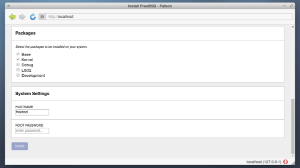
Among the long list of projects detailed in FreeBSD’s April to June 2021 Status Report is a brief update on an experimental installer developed by [Yang Zhong]. In an effort to make the installation of FreeBSD a bit more user friendly, the new installer does away with the classic terminal interface and fully embraces the modern web-centric design paradigm. Once the user has booted into the live OS, they simply need to point the browser to the loopback address at any time to access the installer’s GUI.

Now that alone wouldn’t be particularly groundbreaking. After all, Google has implemented an entire operating system with web frameworks in Chrome OS, so is making the installer a web app really that much of a stretch? But what makes [Yang]’s installer so interesting is that the web interface isn’t limited to just the local machine, it can be accessed by any browser on the network.
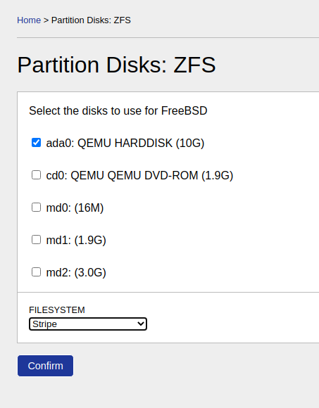
That means you can put the install disc for FreeBSD into a headless machine on your network, and use the browser on your laptop or even smartphone to access the installer. The Graybeards will point out that savvy users have always been able to access the text installer from another computer over SSH, but even the most staunch Luddite has to admit that simply opening a browser on whatever device you have handy and pointing it to the target machine’s IP address is a big usability improvement.

While the software appears complete enough to get through a basic installation, we should remind readers these are still early days. There’s currently no authentication in place, so once you’re booted into the live environment, anyone on the network can format your drives and start the install process.

Some sections of the GUI aren’t fully functional either, with the occasional note from [Yang] popping up to explain what does and doesn’t work. For example, the manual network configuration panel currently only works with WiFi interfaces, as that’s all he personally has to test with. Quite a modern installer, indeed.

Some would argue that part of what makes alternative operating systems like Linux and BSD appealing is the fact that they can happily run on older hardware, so we imagine the idea of an installer using a memory-hungry web browser to present its interface won’t go over well with many users. In our testing, the experimental installer ISO won’t even boot unless it detected at least 4 GB of RAM onboard. But it’s certainly an interesting experiment, and something to keep an eye on as it matures.

[Thanks to Michael for the tip.]

GridSound – An Audio Workstation In Your Browser

If you’re into creating music, you’ll have a surprisingly large variety of open source options at your disposal, ranging from Audacity as rather simple audio editor to Ardour as a full-blown, studio-worthy DAW — and LMMS, Rosegarden, MusE etc. for anything in between. With [Thomas Tortorini]’s GridSound project, you’ll have one additional choice on your list now, except this one runs in your browser. So if you find yourself in a sudden moment of inspiration, all you’ll need is a browser and off you go.

From the feature set’s point of view, GridSound leans towards LMMS and offers a drum kit, piano roll, and synthesizer. It appears that you won’t be able to record real world instruments at this point, but it’s also a work in progress, so who knows what the future will bring. The code is available on GitHub and you can explore GridSound itself here — no login required, unless you want to save your work. Running in a browser, GridSound is naturally written in JavaScript and uses the Web Audio API to perform the actual audio tasks.

What’s impressive is that [Thomas] opted against any UI framework-of-the-week, but instead implemented everything from scratch in pure vanilla JavaScript. In fact, the entire code base seems to be self-contained without any third party dependencies, and that alone deserves some respect. Sure, JavaScript isn’t everybody’s cup of tea — “real developers use assembly” — so if you prefer something more physical, how about some cardboard music?

PHONK – A Hacker’s Fun Shortcut To Android Programming

As the common myth goes, the average human utilizes only about 10% of the true potential their smartphone is capable of. Especially when it comes to electronics projects, it seems that we often overlook how we can integrate and take advantage of their functionality here. Maybe that’s not a big surprise though — while it isn’t rocket science, getting into mobile development certainly has its hurdles and requires a bit of commitment. [Victor Diaz] figured there had to be a better way, so he went on and created PHONK, the self-contained creative scripting toolbox for Android.

PHONK is installed like any other app, and allows rapid prototyping on your Android device via JavaScript by abstracting away and simplifying the heavily boilerplated, native Java parts. So instead of setting up an app from scratch with all the resources defining, UI design, activity and application lifecycle management — not to mention the Android development environment itself — PHONK takes care of all that behind the curtain and significantly reduces the amount of code required to achieve the task you’re actually interested in. In case you’re worrying now that you have to actually program on your phone, well, you can, which can definitely come in handy, but you don’t have to.

Once the app is opened, a web server is started, and connecting to it from any modern browser within the same WiFi network presents you the PHONK development environment with everything you need: editor, file browser, console, and API documentation. You can write your code in the browser, and pressing the run button will execute it straight on the device then. As everything is self-contained within the app itself, no additional software is required, and you can start right away by exploring the set of provided examples that showcase everything supported so far: sensor interaction, BLE server and client, communication protocols like MQTT or WebSockets, OpenStreetMap maps, and even integration with Pure Data and Processing. Attach a USB OTG cable and you can program your Arduino, have serial communication, or interface a IOIO board. You can even connect a MIDI controller.

This is really impressive work done by [Victor], and a lot of attention to detail went into the development. If you have an old Android phone collecting dust somewhere, this would be a great opportunity to revive it and build something with it. And as [Victor] writes on the project’s GitHub page, he’s always curious what people will come up with. If you’re thinking about building a mobile sensor lab, or want to learn more about the sensors inside your phone, have a look at the 36C3 talk about phyphox.