Repairing A Workhorse Bench Meter

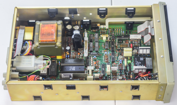
In today’s market, and expensive high-precision bench meter will have a host of features: graphs, alarms, averaging, and more. It will probably even use an operating system. However, old meters can still get the job done at a price that you can actually afford. A case in point is the Fluke 8842A, solid meters with 5.5 digits of resolution and the ability to do two or four wire resistance measurements.  They are built like tanks and are surprisingly affordable, especially if you consider what they went for when new. [Illya Tsemenko] recently updated a log about repairing such a meter, and there is a lot of good information about them if you own one or are thinking about one.

The biggest problem with repairing these meters is that there are several custom parts including the display that are essentially unavailable. For that reason, [Illya] took a meter with a broken display and used it to source parts for another meter.

Continue reading “Repairing A Workhorse Bench Meter”

Toddler-Friendly MP3 Player Navigates With Light

When designing this custom MP3 player for his grandson, [Luc Brun] ran into a unique problem. He wanted the boy to be able to operate the player on his own, but being only 2½ years old, the user interface would have to be exceedingly straightforward. Too many buttons would just be a distraction, and a display with text would be meaningless at his age.

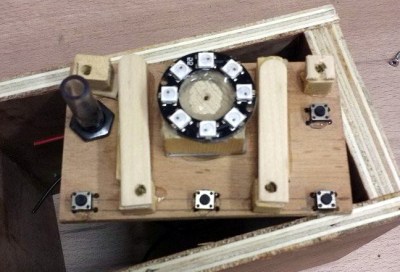
In the end, [Luc] came up with a very interesting way of navigating through directories full of MP3 files using a few push buttons and a ring of WS2812 LEDs. The color of the LEDs indicate which directory or category is currently being selected: spoken nursery rhymes are red, music is orange, nature sounds are yellow, and so on. The number of LEDs lit indicate which file is selected, so in other words, three orange LEDs will indicate the third music track.

At his grandson’s age, we imagine at least a little bit of him navigating through this system is just luck. But as he gets older, he’ll start to form more solid connections between what he’s hearing and the color and number of the LEDs. So not only is this interface a way to help him operate the device himself, but it may serve as a valuable learning tool in these formative years.

On the other hand, if your goal is just to distract a youngster for as long as possible, an overwhelming number of LEDs, buttons, and switches might be exactly what you want.

Metasurface Design Methods Can Make LED Light Act More Like Lasers

Light-emitting diodes (LEDs) are not exactly new technology, but their use over time has evolved from rather dim replacements of incandescent signal lights in control panels to today’s home lighting. Although LEDs have the reputation of being power-efficient, there is still a lot of efficiency to be gained.

UC Santa Barbara researchers [Jonathan Schuller] and his team found that a large number of the photons that are generated never make it out of the LED. This means that the power that was used to generate these photons was essentially wasted. Ideally one would be able to have every single photon successfully make it out of the LED to contribute to the task of illuminating things.

In their paper titled ‘Unidirectional luminescence from InGaN/GaN quantum-well metasurfaces‘  (pre-publication Arxiv version) they describe the problem of photon emission in LEDs. Photons are normally radiated in all directions, causing a ‘spray’ of photons that can be guided somewhat by the LED’s packaging and other parameters. The challenge was thus to start at the beginning, having the LED emit as many photons in one direction as possible.

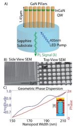
Their solution was the use of a metasurface-based design, consisting out of gallium nitride (GaN) nanorods on a sapphire substrate. These were embedded with indium gallium nitride (InGaN) quantum wells which emit the actual photons. According to one of the researchers, the idea is based on subwavelength antenna arrays already used with coherent light sources like lasers.

With experiments showing the simulated improvements, it seems that this research may lead to even brighter, more efficient LEDs before long if these findings translate to mass production.

(Thanks, Qes)

Inputs Of Interest: Curves Are The Key To My Type

While I may have fallen in love aesthetically with the ErgoDox I built, beauty is only skin deep. And that’s funny, because you can see right through it. But the thing is, it’s just too big and knife-edged to be my daily driver. I keep missing the space bar and thumb-thumping the acrylic wasteland between the thumb cluster and the mainland.

The point was to make a nice portable keeb, even though all my trips for he foreseeable future are going to be limited to the bed or the couch. But it has to be comfortable, and the ErgoDox in its present state simply is not long-term comfortable. I’d take it over a rectangle any day, but it would probably end up being a half day.

Ergo isn’t so much a preference for me as it is a necessity at this point. I feel like I can honestly say that I might not be typing these words to you now if it weren’t for the Kinesis. I don’t want my fingers to do unnecessary legwork, or downgrade from the quality of typing life that concave keys have afforded me. So let me just say that using the ErgoDox made me want to build a dactyl even more than before.

Continue reading “Inputs Of Interest: Curves Are The Key To My Type”

Less Rock, More Roll: A MIDI Barrel Piano

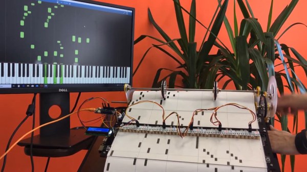
Strolling around a park, pedestrian zone, or tourist area in any bigger city is rarely complete without encountering the sound of a barrel organ — the perfect instrument if arm stamina and steady rotation speed are your kind of musical skills. Its less-encountered cousin, and predecessor of self-playing pianos, is the barrel piano, which follows the same playing principle: a hand-operated crank rotates a barrel, and either pins located on that barrel, or punched paper rolls encode the strings it should pluck in order to play its programmed song. [gabbapeople] thought optocouplers would be the perfect alternative here, and built a MIDI barrel piano with them.

Keeping the classic, hand-operated wheel-cranking, a 3D-printed gear mechanism rolls a paper sheet over a plexiglas fixture, but instead of having holes punched into it, [gabbapeople]’s piano has simple markings printed on them. Those markings are read by a set of Octoliner modules mounted next to each other, connected to an Arduino. The Octoliner itself has eight pairs of IR LEDs and phototransistors arranged in a row, and is normally used to build line-following robots, so reading note markings is certainly a clever alternative use for it.

Each LED/transistor pair represents a dedicated note, and to prevent false positives from neighboring lines, [gabbapeople] 3D printed little collars to isolate each of the pairs. Once the signals are read by the Arduino, they’re turned into MIDI messages to send via USB to a computer running any type of software synthesizer. And if your hands do get tired, you can also crank it with a power drill, as shown in the video after the break, along with a few playback demonstrations.

It’s always fun to see a modern twist added to old-school instruments, especially the ones that aren’t your typical MIDI controllers, like a harp, a full-scale church organ, or of course the magnificently named hurdy-gurdy. And for more of [gabbapeople]’s work, check out his split-flip weather display.

Continue reading “Less Rock, More Roll: A MIDI Barrel Piano”

Ask Hackaday: Are 80 Characters Per Line Still Reasonable In 2020?

Software developers won’t ever run out of subjects to argue and fight about. Some of them can be fundamental to a project — like choice of language or the programming paradigm to begin with. Others seem more of a personal preference at first, but can end up equally fundamental on a bigger scale — like which character to choose for indentation, where to place the curly braces, or how to handle line breaks. Latest when there’s more than one developer collaborating, it’s time to find a common agreement in form of a coding style guide, which might of course require a bit of compromise.

Regardless of taste, the worst decision is having no decision, and even if you don’t agree with a specific detail, it’s usually best to make peace with it for the benefit of uniformly formatted code. In a professional environment, a style guide was ideally worked out collaboratively inside or between teams, and input and opinions of everyone involved were taken into consideration — and if your company doesn’t have one to begin with, the best step to take is probably one towards the exit.

The situation can get a bit more complex in open source projects though, depending on the structure and size of a project. If no official style guide exists, the graceful thing to do is to simply adopt the code base’s current style when contributing to it. But larger projects that are accustomed to a multitude of random contributors will typically have one defined, which was either worked out by the core developers, or declared by its benevolent dictator for life.

In case of the Linux kernel, that’s of course [Linus Torvalds], who has recently shaken up the community with a mailing list response declaring an overly common, often even unwritten rule of code formatting as essentially obsolete: the 80-character line limitation. Considering the notoriety of his rants and crudeness, his response, which was initiated by a line break change in the submitted patch, seems downright diplomatic this time.

[Linus]’ reasoning against a continuing enforcement of 80-char line limits is primarly the fact that screens are simply big enough today to comfortably fit longer lines, even with multiple terminals (or windows) next to each other. As he puts it, the only reason to stick to the limitation is using an actual VT100, which won’t serve much use in kernel development anyway.

Allowing longer lines on the other hand would encourage the use of more verbose variable names and whitespace, which in turn would actually increase readability. Of course, all to a certain extent, and [Linus] obviously doesn’t call for abolishing line breaks altogether. But he has a point; does it really make sense to stick to a decades old, nowadays rather arbitrary-seeming limitation in 2020?

Continue reading “Ask Hackaday: Are 80 Characters Per Line Still Reasonable In 2020?”

Copy And Paste Deemed Insecure

Back when Windows NT was king, Microsoft was able to claim that it met the strict “Orange Book” C2 security certification. The catch? Don’t install networking and remove the floppy drives.  Turns out most of the things you want to do with your computer are the very things that are a security risk. Even copy and paste.

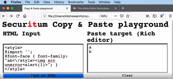
[Michal Benkowki] has a good summary of his research which boils down to the following attack scenario:

  1. Visit a malicious site.
  2. Copy something to the clipboard which allows the site to put in a dangerous payload.
  3. Visit another site with a browser-based visual editor (e.g., Gmail or WordPress)
  4. Paste the clipboard into the editor.

Continue reading “Copy And Paste Deemed Insecure”