Where Old Files Go To Die

We all lead digital lives, and we work in and on files of one sort or another. And sometimes we get attached to them. That long manifesto you poured your heart into, but nonetheless probably shouldn’t see the light of day? Love letters from former flames? Your first favorite video game that you can’t play any more, but it just sits there eating up drive space?

These are the files that are important enough that they deserve better than just a drag-and-drop into the trashcan. They deserve to be buried with dignity, and that’s just what [Ulf Schleth]’s /death/null offers us – a digital graveyard where our files no longer exist as they were, but still are allowed to linger in memory.

This is an old project, but one that tickled our funny  and poignant bones in equal parts. The pun on /dev/null probably works just a little better if you read both filepaths with a German accent in your head, but the idea translates anyway.

To use it, you simply upload your file and it gets sent to the great trashcan in the sky, but along the way a 4 x 5 matrix of colored blocks is created that represents the file, and it is registered forever in the graveyard, where you can check up on it any time you like. Of course you can’t read it – only 20 RGB triples remain – but you have the digital “gravestone” as commemoration.

Even if you don’t have any loved ones in [Ulf]’s graveyard, you can walk by and see which files others have chosen to remember. Swing on by and pay your respects to notepad.exe.

Hackaday Prize 2023: Tilting Mechanical Panels Make A Beautiful Display

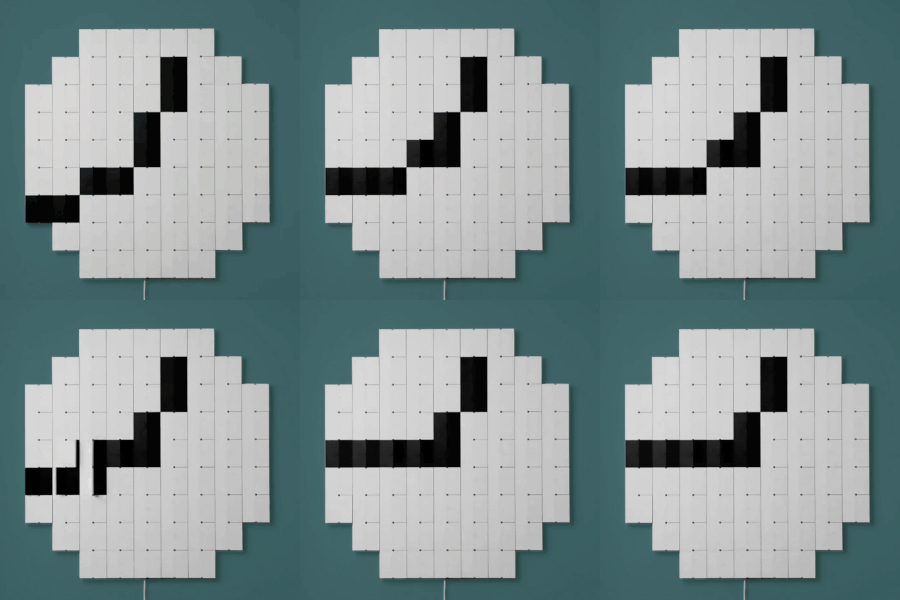
Mechanical displays use a variety of different methods to represent data with physical objects, and [AIRPOCKET]’s Mechanical Display aims to be a platform anyone can use. Each “pixel” in this display is a panel of some kind, and different effects can be had by moving individual panels to different angles. Not only can images be represented, but the patterns of the movements themselves can be beautiful as well.

The panels are an important part of how the display presents, so the design makes them easy to change out.

These sorts of displays are fertile ground for artistic expression (one memorable implementation of this basic idea was the wooden mirror, which used varnished tiles of wood) but anyone looking to use the concept has usually been on their own when it comes to implementation.

The idea [AIRPOCKET] has is to make this kind of installation easier to implement. This method uses economical mini RC servos and 3D-printed pieces to create modular segments that can be assembled into whatever configuration one may need.

The material of the panels matters, too. Just below the page break, you can see a large unit with each “pixel” consisting of a mirrored square that reflects daylight. There’s also a video of an earlier prototype that uses some ridged two-color pieces to create a simple 4×4 three-level greyscale display.

There are a lot of possibilities if [AIRPOCKET] can make this sort of display more easily accessible, and that makes it a contender in the 2023 Hackaday Prize.

Continue reading “Hackaday Prize 2023: Tilting Mechanical Panels Make A Beautiful Display”

These Illusions Celebrate Exploiting Human Senses

Illusions are perceptual experiences that do not match physical reality, and the 2023 Illusion of the Year contest produced a variety of nifty ones that are worth checking out. A video for each is embedded below the break, but we’ll briefly explain each as well.

Some of the visual illusions play with perspective. One such example happens to be the contest winner: Platform 9 3/4 has a LEGO car appear to drive directly through a wall. It happens so quickly it’s difficult to say what happened at all!

Another good one is the Tower of Cubes, which appears as two stacks of normal-looking hollow cubes, but some of the cubes are in fact truly bizarre shapes when seen from the side. This is a bit reminiscent of the ambiguous cylinder illusion by Japanese mathematician and artist [Kokichi Sugihara].

Cornelia is representative of the hollow face illusion, in which a concave face is perceived as a normal convex one. (Interestingly this illusion is used to help diagnose schizophrenia, as sufferers overwhelmingly fail to perceive the illusion.)

The Accelerando Illusion is similar to (but differs from) an auditory effect known as the Risset Rhythm by composer Jean-Claude Risset. It exploits ambiguities in sound to create a dense musical arrangement that sounds as though it is constantly increasing in tempo.

The Buddha’s Ear Illusion creates the illusion of feeling as though one’s earlobe is being stretched out to an absurd length, and brings to mind the broader concept of body transfer illusion.

While it didn’t appear into the contest, we just can’t resist bringing up the Thermal Grill Illusion, in which one perceives a painful burning sensation from touching a set of alternating hot and cold elements. Even though the temperatures of the individual elements are actually quite mild, the temperature differential plays strange tricks on perception.

A video of each of the contest’s entries is embedded below, and they all explain exactly what’s going on for each one, so take a few minutes and give them a watch. Do you have a favorite illusion of your own? Share it in the comments!

Continue reading “These Illusions Celebrate Exploiting Human Senses”

AI Image Generation Gets A Drag Interface

AI image generators have gained new tools and techniques for not just creating pictures, but modifying them in consistent and sensible ways, and it seems that every week brings a fascinating new development in this area. One of the latest is Drag Your GAN, presented at SIGGRAPH 2023, and it’s pretty wild.

It provides a point-dragging interface that modifies images based on their implied structure. A picture is worth a thousand words, so this short animation shows what that means. There are plenty more where that came from at the project’s site, so take a few minutes to check it out.

GAN stands for generative adversarial network, a class of machine learning that features prominently in software like image generation; the “adversarial” part comes from the concept of networks pulling results between different goalposts. Drag Your GAN has a GitHub repository where code is expected to be released in June, but in the meantime, you can read the full paper or brush up on the basics of how AI image generators work, as well as see how image generation can be significantly enhanced with an understanding of a 2D image’s implied depth.

3D Model Subscriptions Are Coming, But Who’s Buying?

We’ve all been there before — you need some 3D printable design that you figure must be common enough that somebody has already designed it, so you point your browser to Thingiverse or Printables, and in a few minutes you’ve got STL in hand and are ready to slice and print. If the design worked for you, perhaps you’ll go back and post an image of your print and leave a word of thanks to the designer.

Afterwards, you’ll probably never give that person a second thought for the rest of your life. Within a day or two, there’s a good chance you won’t even remember their username. It’s why most of the model sharing sites will present you with a list of your recently downloaded models when you want to upload a picture of your print, otherwise there’s a good chance you wouldn’t be able to find the thing.

Now if you really liked the model, you might go as far as following the designer. But even then, there would likely be some extenuating circumstances. After all, even the most expertly designed widget is still just a widget, and the chances of that person creating another one that you’d also happen to need seems exceedingly slim. Most of the interactions on these model sharing sites are like two ships passing in the night; it so happened that you and the creator had similar enough needs that you could both use the same printable object, but there’s no telling if you’ll ever cross paths with them again.

Which is why the recent announcements, dropped just hours from each other, that both Thangs and Printables would be rolling out paid subscription services seems so odd. Both sites claim that not only is there a demand for a service that would allow users to pay designers monthly for their designs, but that existing services such as Patreon are unable to meet the unique challenges involved.

Both sites say they have the solution, and can help creators turn their passion for 3D design into a regular revenue stream — as long as they get their piece of the action, that is.

Continue reading “3D Model Subscriptions Are Coming, But Who’s Buying?”

Oscillon by Ben F. Laposky

Early Computer Art From The 1950s And 1960s

Modern day computer artist, [Amy Goodchild] surveys a history of Early Computer Art from the 1950s and 1960s. With so much attention presently focused on AI-generated artwork, we should remember that computers have been used to created art for many decades.

Our story begins in 1950 when Ben Laposky started using long exposure photography of cathode ray oscilloscopes to record moving signals generated by electronic circuits. In 1953, Gordon Pask developed the electromechanical MusiColor system. MusiColor empowered musicians to control visual elements including lights, patterns, and motorized color wheels using sound from their instruments. The musicians could interact with the system in real-time, audio-visual jam sessions.

In the early 1960s, BEFLIX (derived form Bell Flix) was developed by Ken Knowlton at Bell Labs as a programming language for generating video animations. The Graphic 1 computer featuring a light pen input device was also developed at Bell Labs. Around the same timeframe, IBM introduced novel visualization technology in the IBM 2250 graphics display for its System/360 computer. The 1967 IBM promotional film Frontiers in Computer Graphics demonstrates the capabilities of the system.

Continue reading “Early Computer Art From The 1950s And 1960s”

Making Music By Probing Magnetite Crystals

Well, noises anyway. [Dmitry Morozov] and [Alexandra Gavrilova] present an interesting electronics-based art installation, which probes a large chunk of crystalline magnetite, using a pair of servo-mounted probes, ‘measuring’ the surface conductivity and generating some sound and visuals.

It appears to have only one degree of freedom per probe, so we’re not so sure all that much of the surface gets probed per run, but however it works it produces some interesting, almost random results. The premise is that the point-to-point surface resistivity is unpredictable due to the chaotically formed crystals all jumbled up, but somehow uses these measured data to generate some waveshapes vaguely reminiscent of the resistivity profile of the sample, the output of which is then fed into a sound synthesis application and pumped out of a speaker. It certainly looks fun.

From a constructional perspective, hardware is based around a LattePanda fed samples by an ADS1115 ADC, which presumably is also responsible for driving the LCD monitor and the sound system. An Arduino is also wedged in there perhaps for servo-driving duty, maybe also as part of the signal chain from the probes, but that is just a guess on our part. The software uses the VVVV (Visual Live-programming suite) and the Pure Data environment.

We haven’t seen magnetite used for this type of application before, we tend to see it as a source of Iron for DIY knifemaking, as a medium to help separate DNA or just to make nanoparticles, for erm, reasons.