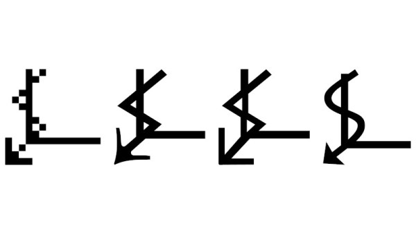
Baseball is in full swing again, and having recently accepted a position with Major League Baseball, [Ty Porter] is warming up with a big contribution to the MLB LED Scoreboard project — modifying 20-some old fonts to support baseball’s ‘ꓘ’ character that indicates a special strikeout with a called third strike (meaning the batter didn’t take a swing).
The problem is that Major League Baseball-the-entity recently deprecated the original data source for the scoreboard project. This called for a huge refactor of the codebase, including previously-patched fonts which were now showing either the font’s default no-character character, or nothing at all.
Fortunately, BDF font files are fairly human-readable and make reference to bitmap, which is an actual bitmap in hex. [Ty] settled on Unicode A4D8 (ꓘ), a character from the Tibeto-Burman language Lisu that certainly looks good enough to this baseball fan. Then it became a matter of mirroring the bitmap for ‘K’. [Ty] tried a few things like reversing the nibbles and looking up each one in a table, but that also mirrors the padding, which is bad news.
Then he tried not reversing the nibbles and just looked them up in a table, but this approach dropped and added bits unintentionally. Finally, he tried reversing the order, looking up the reversed nibble, and shifting each byte until there was no padding. This worked for most of the 20 fonts [Ty] patched. The others fell in line with some manual work.
We start this week with news from Mars, because, let’s face it, the news from this planet isn’t all that much fun lately. But a couple of milestones were reached on the Red Planet, the first being the arrival of Perseverance at the ancient river delta it was sent there to explore. The rover certainly took the scenic route to get there, having covered 10.6 km over the last 424 sols to move to a position only about 3.5 km straight-line distance from where it landed. Granted, a lot of that extra driving was in support of the unexpectedly successful Ingenuity demonstration, plus taking time for a lot of pit stops along the way at interesting features. But the rover is now in place to examine sedimentary rocks most likely to harbor the fossil remains of ancient aquatic life — as opposed to the mainly igneous rocks it has studied along the crater floor so far. We’re looking forward to seeing what happens.
For anyone old enough to have worked with the hell of multiple incompatible character sets, Unicode has been a liberation; a true One Character Set To Contain Them All. We have so many Unicode characters to play with that there’s a fascinating pursuit in itself in probing at the obscure corners of what can be rendered on screen as a Unicode glyph. With so many disparate character sets having been brought together to make the Unicode standard there are plenty of unusual characters to choose from, and it’s one of them that [Jonathan Chan] has examined in detail.
U+237C ⍼, or the right angle with downwards zigzag arrow, is a mysterious Unicode symbol with no known use and from an unknown origin. XKCD featured it as a spoof “Larry Potter”, but as [Jonathan]’s analysis shows it’s proving impossible to narrow down where it came from. Mystical cult symbol? Or perhaps fiscal growth in an economy in which time runs downwards? Either way, when its lineage has been traced into the early 1990s with no answer to the question it appears that there may be a story behind it.
Hackaday readers never cease to amaze us with the breadth of their knowledge, ingenuity, and experience, so we think it’s not impossible that among you there may be people who will turn and pull a dusty computer manual from the shelf to give us the story behind this elusive glyph. We’d love to hear in the comments below.
Well, that de-escalated quickly. It seems like no sooner than a paper was announced that purported to find photographic evidence of fungi growing on Mars, that the planetary science and exobiology community came down on it like a ton of bricks. As well they should — extraordinary claims require extraordinary evidence, and while the photos that were taken by Curiosity and Opportunity sure seem to show something that looks a lot like a terrestrial puffball fungus, there are a lot of other, more mundane ways to explain these formations. Add to the fact that the lead author of the Martian mushroom paper is a known crackpot who once sued NASA for running over fungi instead of investigating them; the putative shrooms later turned out to be rocks, of course. Luckily, we have a geobiology lab wandering around on Mars right now, so if there is or was life on Mars, we’ll probably find out about it. You know, with evidence.
If you’re a fan of dystopic visions of a future where bloodthirsty robots relentlessly hunt down the last few surviving humans, the news that the New York Police Department decided to stop using their “DigiDog” robot will be a bit of a downer. The move stems from outrage generated by politicians and citizens alike, who dreamt up all sorts of reasons why the NYPD shouldn’t be using this tool. And use it they apparently did — the original Boston Dynamics yellow showing through the many scuffs and dings in the NYPD blue paint job means this little critter has seen some stuff since it hit the streets in late 2020. And to think — that robot dog was only a few weeks away from filing its retirement papers.
Attention, Commodore fans based in Europe: the Commodore Users Europe event is coming soon. June 12, to be precise. As has become traditional, the event is virtual, but it’s free and they’re looking for presenters.
In a bid to continue the grand Big Tech tradition of knowing what’s best for everyone, Microsoft just announced that Calibri would no longer be the default font in Office products. And here’s the fun part: we all get to decide what the new default font will be, at least ostensibly. The font wonks at Microsoft have created five new fonts, and you can vote for your favorite on social media. The font designers all wax eloquent on their candidates, and there are somewhat stylized examples of each new font, but what’s lacking is a simple way to judge what each font would actually look like on a page of English text. Whatever happened to “The quick brown fox” or even a little bit of “Lorem ipsum”?
And finally, why are German ambulances — and apparently, German medics — covered in QR codes? Apparently, it’s a way to fight back against digital rubberneckers. The video below is in German, but the gist is clear: people love to stop and take pictures of accident scenes, and smartphones have made this worse, to the point that emergency personnel have trouble getting through to give aid. And that’s not to mention the invasion of privacy; very few accident victims are really at their best at that moment, and taking pictures of them is beyond rude. Oh, and it’s illegal, punishable by up to two years in jail. The idea with the QR codes is to pop up a website with a warning to the rubbernecker. Our German is a bit rusty, but we’re pretty sure that translates to, “Hey idiot, get back in your frigging car!” Feel free to correct us on that.
Where’s the last place you’d expect to be able to play a game on your computer? The word processing program? Image editor? How about your text editor? That’s right — you can fight your Fontemons in any program that makes use of fonts, because mad genius [Michael Mulet] has created a game that exists entirely within a single Open Type font file.
[Michael] has harnessed the power of ligatures to create a choose-your-own-adventure-style turn-based game that pokes fun at both Pokemon and various typeface names. You start by choosing between Papyromaniac, Verdanta, and Proggito and face off against enemies like Helvetikhan and Scourier.
This works because there are many ways to draw glyphs on a screen. [Michael] chose Type 2 Charstrings, which is a vector graphics format that Adobe created for PostScript. It can draw pixels with a series of move specifications that tell it to draw up, to the right, and then back down before closing off the pixel with an implicit operator that draws from the starting point to the ending point. [Michael] was able to create two shades of gray by drawing smaller versions of the pixels and making the image by combining white and black pixels.
If you just want to play the game, you can either download the .otf file or just try it out in the browser. You’re supposed to use ‘a’ and ‘b’ to make choices that advance the game, but we soon discovered that spamming other keys like ‘v’ and Enter will lead to strange places. If you play it straight, it takes about 20 minutes, but there are enough secrets built in to make it last five times as long. [Michael] was kind enough to create a tutorial for making font-based games, but if you just want to get going, the game engine is open source.
Here’s a neat little trick: take the jaggies out of scaled fonts on the fly! This technique is for use on graphic displays where you might want to scale your fonts up. Normally you’d just write a 2×2 block of pixels for every area where there would have been one pixel and boom, larger font. Problem is, that also multiplies each empty area and you end up with jagged edges in the transitions that really catch your eye.
[David Johnson-Davies] entered big-brain mode and did something much cleverer than the obvious solution of using multiple font files. Turns out if you analyze the smoothing problem you’ll realize that it’s only the angled areas that are to blame, horizontal and vertical scaling are nice and smooth. [David’s] fix looks for checker patterns in what’s being drawn, adding a single pixel in the blank spots to smooth out the edge incredibly well!
The technique has been packaged up in a simple function that [David] wrote to play nicely in the Arduino ecosystem. However, the routine is straightforward and would be quick to implement no matter the language or controller. Keep this one in your back pocket!
Now if all you have on hand is an HD44780 character LCD, that one’s arguably even more fun to hack around on just because you’re so limited on going beyond the hard-coded font set. We’ve seen amazing things like using the custom character slots to play Tetris.
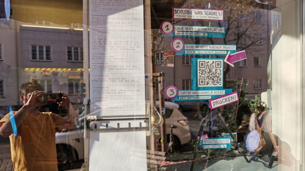
We live in a strange time indeed. People who once eschewed direct interactions with fellow humans now crave it, but to limited avail. Almost every cashier at the few stores deigned essential enough to maintain operations are sealed away behind plastic shields, with the implication that the less time one spends lingering, the better. It’s enough to turn an introvert into an extrovert, at least until the barriers are gone.
We get the idea that the need to reach out and touch someone is behind [Niklas Roy]’s “Please Leave a Message”, an interactive art installation he set up in the front window of his Berlin shop. Conveniently located on a downtown street, his shop is perfectly positioned to attract foot traffic, and his display is designed to catch the eye and perhaps crack a smile. The device consists of a large wooden easel holding the guts from an old X-Y pen plotter, an Arduino and an ESP-8266, and a couple of drivers for the plotter’s steppers. Passers-by are encouraged to scan a QR code that accesses a web page served up by the ESP-8266, where they can type in a brief message. The plotter dutifully spells it out on a scroll of paper for all to see, using a very nice font that [Niklas] designed to be both readable and easily plotted. The video below shows it in action with real people; it seems to be a crowd-pleaser.


 [David Johnson-Davies] entered big-brain mode and did something much cleverer than the obvious solution of using multiple font files. Turns out if you analyze the smoothing problem you’ll realize that it’s only the angled areas that are to blame, horizontal and vertical scaling are nice and smooth. [David’s] fix looks for checker patterns in what’s being drawn, adding a single pixel in the blank spots to smooth out the edge incredibly well!