Call us crazy, but music was a whole lot more fun when it was on physical media. Or perhaps just easier to use, especially in the car. Whether your particular vintage favored CDs, cassettes, or even 8-tracks, being able to fish out that favorite album and slam it in the player while never taking your eyes off the road was a whole lot easier than navigating a playlist on a locked phone, or trying to control an infotainment system through soft buttons on a touch screen.
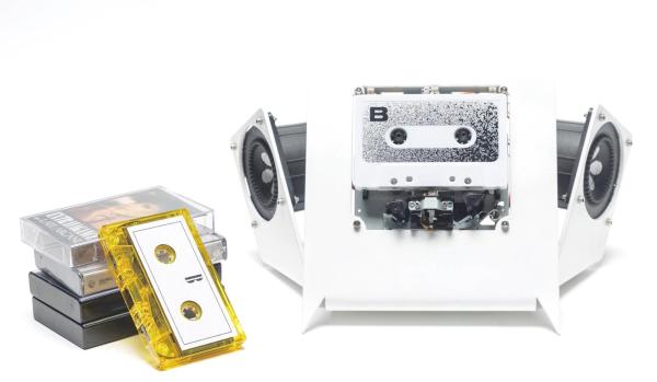
It seems like [Jarek Lupinski] is as much a Spotify Luddite as we are, since his “tape-deck” project is aimed to be as user-unfriendly as possible. It’s just an auto-reversing cassette deck movement stripped bare of all useful appurtenances, like a way to fast forward or rewind. You just put a cassette in and it plays, start to finish, before auto-reversing to play the other side in its entirety. It doesn’t even have a volume control — his cheeky advice is to “listen to louder or quieter albums” to solve that problem. Pretty easy, really, and not a EULA or advertisement in sight. Build files are available if you hate yourself enough to build one of your own.
All kidding aside, this is kind of a nice reminder of how much things have changed, and how much complexity we’ve layered onto the simplest of pleasures. If you like the minimalist approach of this project but not the deconstructed aesthetics, we’ve got you covered.
Many of us grew up watching Star Trek, marvelling at the beautiful colorful interfaces on the computers that ran the Starship Enterprise. Today’s computer interfaces have certainly grown fancier since the Windows 3.1 and Mac System 7 days, but they’re still nowhere near that gorgeous. The Arwes framework aims to change that, at least where web apps are concerned.
The framework is inspired by the cyberprep and synthwave aesthetics, while drawing from media like TRON: Legacy and Halo. You can get a peek at what it can do on the Arwes website, or look at how it runs on sites like SoulExtract or the Cyber Movie Database. It’s very much about glowing lines, 1980s computer sounds, and screens with animated text fills.
It’s still in an alpha release, and likely isn’t yet ready for business-critical production use. It currently consists of a set of basic components that can be assembled into a functional futuristic website design, but you’ll need some experience to use the tools at hand. There’s a sandbox for experimenting that should help in that regard.
You might just find that it’s the perfect tool to create an interface for your very own cyberdeck, or you might put it to work on your next website design. Either way, if you create something fantastic, don’t hesitate to drop us a line.
Remember all the hubbub over Betelgeuse back in February? For that matter, do you even remember February? If you do, you might recall that the red giant in Orion was steadily dimming, which some took as a portent of an impending supernova. That obviously didn’t happen, but we now seem to have an explanation for the periodic dimming: an enormous dark spot on the star. “Enormous” doesn’t begin to describe this thing, which covers 70% of the face of a star that would extend past Jupiter if it replaced the sun. The dimming was originally thought to be dust being blown off the star as it goes through its death throes, but no evidence could be found for that, while direct observations in the terahertz range showed what amounted to a reduction in surface temperature caused by the enormous star spot. We just think it’s incredibly cool that Betelgeuse is so big that we can actually observe it as a disk rather than a pinpoint of light. At least for now.
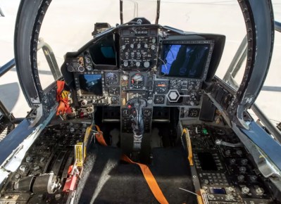
If you think you’ve seen some challenging user interfaces, wait till you get a load of the cockpit of an F-15C Eagle. As part of a new series on human interfaces, Ars Technica invited Col. Andrea Themely (USAF-ret.) to give a tour of the fighter she has over 1,100 hours on. Bearing in mind that the Eagle entered service in 1976 and has been continually updated with the latest avionics — compare the video with the steam gauges of the cockpit of an F-15A — its cockpit is still a pretty busy place. As much as possible has been done to reduce pilot load, with controls being grouped by function and the use of color-coding — don’t touch the yellow and black stuff! — and the use of tactile feedback. It’s a fascinating deep dive into a workplace that few of us ever get to see, and we’re looking forward to the rest of the series.
Sad news from Seattle, where the Living Computers: Museum + Labs is closing up shop. The announcement only says they’re closing “for now”, so there’s at least some hope that the museum will be back once the COVID-19 downturn has run its course. We hope they do bounce back; it really was a great museum with a lot of amazing hardware on display. The Vintage Computer Festival PNW was held there in its inaugural year, an event we covered and had high hopes for in the future. We hope for the best for these educational and cultural institutions, but we can’t help but fear a little for their future.
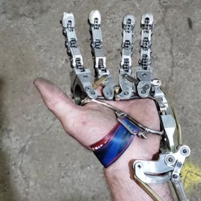
So you suffer a partial amputation of your left hand, leaving you with only your thumb and your palm. That raises an interesting conundrum: you haven’t lost enough to replace the hand with a prosthetic one, but you still don’t have any fingers. That appears to be what happened to Ian Davis, and so he built his own partial prosthetic to replace his fingers. There’s not much backstory on his YouTube channel, but from what we can gather he has gone through several designs, most of which are myomechanical rather than myoelectric. Through a series of complex linkages, he’s able to control not only the opening and closing of the fingers, but also to splay them apart. It’s all in the wrist, as it were — his input gestures all come from flexing and extending his hand relative to his forearm, where the prosthesis is anchored. This results in a pretty powerful grip — much stronger than a myoelectric hand in a head-to-head test. And the coolness factor of his work is just off the scale. We’re looking forward to more from Ian, and hopefully enough background information for a full story on what he has accomplished.
We all know the feeling of watching a movie set in a galaxy far, far away and seeing something that makes us say, “That’s not realistic at all!” The irony of watching human actors dressed up as alien creatures prancing across a fantasy landscape and expecting realism is lost on us as we willingly suspend disbelief in order to get into the story; seeing something in that artificial world that looks cheesy or goofy can shock you out of that state and ruin the compact between filmmaker and audience.
Perhaps nowhere do things get riskier for filmmakers than the design of the user interfaces of sci-fi and fantasy sets. Be they the control panels of spacecraft, consoles for futuristic computers, or even simply the screens of phones that are yet to be, sci-fi UI design can make or break a movie. The job of designing a sci-fi set used to be as simple as wiring up strings of blinkenlights; now, the job falls to a dedicated artist called a Playback Designer who can create something that looks fresh and new but still plausible to audiences used to interacting with technology that earlier generations couldn’t have dreamed of.
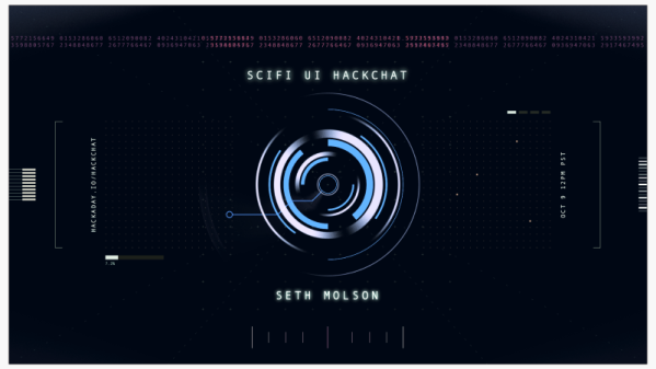
Seth Molson is one such artist, and you’ve probably seen some of his work on shows such as Timeless, Stargate Universe, and recently Netflix’s reboot of Lost in Space. When tasked to deliver control panels for spacecraft and systems that exist only in a writer’s mind, Seth sits down with graphics and animation software to make it happen.
Join us as we take a look behind the scenes with Seth and find out exactly what it’s like to be a Playback Designer. Find out what Seth’s toolchain looks like, how he interacts with the rest of the production design crew to come up with a consistent and believable look and feel for interfaces, and what it’s like to design futures that only exist — for now — in someone’s imagination.
Click that speech bubble to the right, and you’ll be taken directly to the Hack Chat group on Hackaday.io. You don’t have to wait until Wednesday; join whenever you want and you can see what the community is talking about.
The first LED digital wristwatches hit the market in the 1970s. They required a button push to turn the display on, prompting one comedian to quip that giving one to a one-armed man would be in poor taste. While the UIs of watches and other wearables have improved since then, smartphones still present some usability challenges. Some of the touch screen gestures needed to operate a phone, like pinching, are nigh impossible when one-handing the phone, and woe unto those with stubby thumbs when trying to take a selfie.
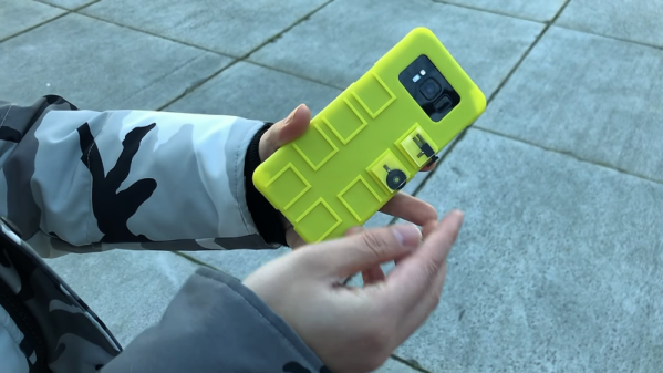
You’d think that the fleet of sensors and the raw computing power on board would afford better ways to control phones. And you’d be right, if the modular mechanical input widgets described in a paper from Columbia University catch on. Dubbed “Vidgets” by [Chang Xiao] et al, the haptic devices are designed to create characteristic acceleration profiles on a phone’s inertial measurement unit (IMU) when actuated. Vidgets take various forms, from push buttons to scroll wheels, each of a similar size and shape and designed to dock into one of eight positions on the back of a 3D-printed phone case. Once trained, the algorithm watches for the acceleration signature caused by actuating a Vidget, and sends commands to the phone to mimic the corresponding gestures. The video below demonstrates a couple of use cases, of which the virtual saxophone is our favorite.
This is really clever stuff, and ventures deep into “Why didn’t I think of that?” territory. Need to get ahead of the curve on IMUs to capitalize on what they can do? You could start with [Al Williams]’ primer on micro-electromechanical systems, or MEMS.
(Pedantic Editor’s Note: VFDs actually run a little warm.)
At least that’s the reasoning [Scott M. Baker] applied to his Prusa upgrade. We have to admit to a certain affection for all retro displays relying on the excitation of gasses. Nixies, Numitrons, and even the lowly neon pilot light all have a certain charm of their own, but by our reckoning the VFD leads the pack. [Scott] chose a high-quality Noritake 4×20 alphanumeric display module for his upgrade, thriftily watching eBay for bargains rather than buying from the big distributors. The module has a pinout that’s compatible with the OEM LCD, so replacing it is a snap. [Scott] simplified that further by buying a replacement Prusa control board with no display, to which he soldered the Noritake module. Back inside the bezel, the VFD is bright and crisp. We like the blue-green digits against the Prusa red-orange, but [Scott] has an orange filter on order for the VFD to make everything monochromatic. That’ll be a nice look too.
A completely none functional hack, to be sure, but sometimes aesthetics need attention too. And it’s possible that a display switch would help the colorblind use the UI better, like this oscilloscope mod aims to do.
The Kinect is awesome, but if you want to do anything at a higher resolution detecting a person’s limbs, you’re out of luck. [Chris McCormick] over at CogniMem has a great solution to this problem: use a neural network on a chip to recognize fingers with hardware already connected to your XBox.
The build uses the very cool CogniMem CM1K neural network on a chip trained to tell the difference between counting from one to four on a single hand, as well as an ‘a-okay’ sign, Vulcan greeting (shown above), and rocking out at a [Dio] concert. As [Chris] shows us in the video, these finger gestures can be used to draw on a screen and move objects using only an open palm and closed fist; not too far off from the Minority Report and Iron Man UIs.
If you’d like to duplicate this build, we found the CM1K neural network chip available here for a bit more than we’d be willing to pay. A neural net on a chip is an exceedingly cool device, but it looks like this build will have to wait for the Kinect 2 to make it down to the consumer and hobbyist arena.
You can check out the videos of Kinect finger recognition in action after the break with World of Goo and Google Maps.