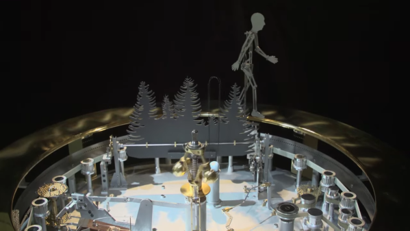
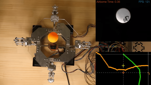
Antique Map Of Paris With Modern Tech

There’s plenty to love about antiques, from cars, furniture, to art. While it might be a little bit of survivorship bias, it’s easy to appreciate these older things for superior quality materials, craftsmanship, or even simplicity. They are missing out on all of our modern technology, though, so performing “restomods” on classics is a popular activity nowadays. This antique map of Paris, for example, is made of a beautiful hardwood but has been enhanced by some modern amenities as well.

At first the creator of this project, [Marc], just wanted to give it some ambient lighting, but it eventually progressed over the course of two years to have a series of Neopixels hidden behind it that illuminate according to the current sun and moon positions. The Neopixels get their instructions from an ESP8266 which calculates these positions using code [Marc] wrote himself based on the current date. Due to the limitations of the ESP8266 it’s not particularly precise, but it gets the job done to great effect.

To improve on the accuracy, [Marc] notes that an ESP32 could be used instead, but we can give the ESP8266 a pass for now since the whole project is an excellent art installation even if it is slightly off on its calculations. If you need higher accuracy for tracking celestial objects, you can always grab a Raspberry Pi too.

A Few Of My Favorite Things: Pens

Pens! They just might be the cheapest, most important piece of technology ever overlooked by a large group of people on a daily basis. Pens are everywhere from your desk to your car to your junk drawer, though they tend to blink out of existence when you need one. Where would we be without them? Probably still drawing on cave walls with dandelions and beets.

Photo of a Pilot Metropolitan by Aaron Burden on Unsplash

Why do I think pens are so great? Well, they’re a relatively cheap tool depending on the pen you get, but whatever you spend, you’re getting a lot for your money. Pens are possibility, pure and simple, and they’re even conveniently packaged in a portable device.

Aesthetically speaking, I like pens because of how different they can be both inside and out. Some of them make thick lines, some make thin lines, and in the case of flexible nibs, some alternate between thick and thin lines depending on pressure. I use pens for a number of reasons, most notably for writing. Everything you read here that bears my name began life as pen marks on paper.

Pens are revolutionary because they can be used to make ideas permanent and/or illustrate any concept. It’s up to you to use the pen wisely. You can use other, better tools later, but pens are always a great first tool. If you’re not encumbered by an uncomfortable grip, ink that skips, or a scratchy, draggy contact point, your ideas will flow more freely. When you find the right pen for you, you aren’t hindered by your tool — you’re elevated by it. Continue reading “A Few Of My Favorite Things: Pens”

sample of automatically generated comics

Read Your Movies As Automatically Generated Comic Books

A research paper from Dalian University of Technology in China and City University of Hong Kong (direct PDF link) outlines a system that automatically generates comic books from videos. But how can an algorithm boil down video scenes to appropriately reflect the gravity of the scene in a still image? This impressive feat is accomplished by saving two still images per second, then segments the frames into scenes through analysis of region-of-interest and importance ranking.

movie to comic book pipeline diagram

For its next trick, speech for each scene is processed by combining subtitle information with the audio track of the video. The audio is analyzed for emotion to determine the appropriate speech bubble type and size of the subtitle text. Frames are even analyzed to establish which person is speaking for proper placement of the bubbles. It can then create layouts of the keyframes, determining panel sizes for each page based on the region-of-interest analysis.

The process is completed by stylizing the keyframes with flat color through quantization, for that classic cel shading look, and then populating the layouts with each frame and word balloon.

The team conducted a study with 40 users, pitting their results against previous techniques which require more human intervention and still besting them in every measure. Like any great superhero, the team still sees room for improvement. In the future, they would like to improve the accuracy of keyframe selection and propose using a neural network to do so.

Thanks to [Qes] for the tip!

Flip-Dots Enter The Realm Of Fine Art

Flip-dot displays look and sound awesome. At least to all of us electronics geeks who dumpster dive for second-hand panels to add to our collections of esoteric display technology. But there are people thinking beyond the yellow/white dots on a black background. [BreakfastNY] have produced a new take on what a flip-dot display can be with color and a bit of theatrics.

Mechanically these are standard pixels that use an electromagnetic coil to pivot a disc between two states. But immediately you’ll see the inert display has a mosaic printed right on the dots. It gets even more fun to realize the same image is present on the rear of the dots but in a different color palette. In the case of this piece, entitled Empire State, it looks like a sunny day on one side and an overcast day on the reverse.

We wondered what this art collective was up to when they began selling flip-dot modules they had designed back in 2016. Having those kinds of connections meant they were able to sweet-talk their manufacturing partners into custom printing colors on the discs during manufacture. The group continues to use their camera-based interactivity that represents silhouettes on the display. The innovative color palette still lets that work quite well, but one really interesting animation choice here is an indeterminate flutter of the pixels. It builds a Matrix-style waterfall animating into the image, beckoning the viewer to walk over with the ulterior motive that this brings them within camera range.

If you want to give the flutter effect a try for yourself, you might want to peek at the 30 FPS flip-dot driver we saw a few weeks back as a responsive option.

Continue reading “Flip-Dots Enter The Realm Of Fine Art”

An Algorithm For Art: Thread Portraits

We’ve all been there — through the magic of the internet, you see someone else’s stunning project and you just have to replicate it. For [Jenny Ma], that project was computer-generated string art, as in the computer figures out the best nail order to replicate a given image, and you lay out the thread yourself.

So, how does it work? Although a few algorithms are out there already, [Jenny] wanted to make her own using Python. Essentially it crops the image into a circle and then lays out evenly-spaced software nails around the circumference. The algorithm starts from a random nail and then determines the best next nail to wrap around by drawing a line from that nail to every other nail and choosing the darkest one based on the darkness of the image underneath that little line. It repeats this one chord at a time, subtracting from the original image until every pixel has been replaced with a thread or lack thereof, and then it spits out an ordered list of nail numbers.

Once the software was ready, [Jenny] made a wood canvas that’s 80 cm (31.5″) in diameter and started laying out the nail hole locations. There wasn’t quite enough room for 300 nails, so instead of starting over, [Jenny] changed the algorithm to use 298 nails and re-ran it.

[Jenny] does a great job of discussing the many variables at play in this hardware representation of software-created art. The most obvious of course is that the more nails used, the higher the resolution would be, but she determined that 300 is the sweet spot — more than that, and the resolution doesn’t really improve. We have to wonder if 360 nails would make things any easier. Check out the build video after the break.

Want to cut out most of the manual labor altogether? Build yourself a string art machine.

Continue reading “An Algorithm For Art: Thread Portraits”

LEGO Lunar Lander Animatronic Movie Released

Retired scientist [Mark Howe] spent the last couple months making an animatronic movie featuring his LEGO lunar lander in a video recreation of the Apollo 11 moon landing (also embedded below). [Mark] is not only the producer, but serves as the technical director, set designer, and cameraman as well. He designed and 3D-printed a custom special effects stage for the scene. It gives motion to the LEM using stepper motors, timing belts, pulleys, and a linear guide rod, all hidden inside a discrete upstage tower. He simulates the Lunar regolith using grout, spray adhesive, and a smattering of small rocks.

[Mark] implements the special effects sequencer in an Arduino Nano, and provides sound effects using an Adafruit audio sound board which he loaded up with sound files from the real Apollo 11 landing. Floor strip lighting is provided by an array of Neopixels, and a back-lit Earth is lowered from the fly space for one cut. He made a custom PCB motherboard to hold the Arduino, sound card and motor drivers.

The resulting production is quite impressive. This isn’t [Mark]’s first attempt to relieve the double boredom of both retirement and coronavirus isolation — back in December he produced a similar animatronic movie recreating a Saturn V launch. Thanks to [jhookie55] for the tip.

Continue reading “LEGO Lunar Lander Animatronic Movie Released”

Perlin Noise Helps Make Trippy Typographic Art

Perlin noise is best explained in visual terms: if a 2D slice of truly random noise looks like even and harsh static, then a random 2D slice of Perlin noise will have a natural-looking blotchy structure, with smooth gradients. [Jacob Stanton] used Perlin noise as the starting point for creating some interesting generative vector art that shows off all kinds of different visuals. [Jacob] found that his results often exhibited a natural quality, with the visuals evoking a sense of things like moss, scales, hills, fur, and “other things too strange to describe.”

The art project [Jacob] created from it all is a series of posters showcasing some of the more striking examples, each of which displays an “A” modified in a different way. A few are shown here, and a collection of other results is also available.

Perlin noise was created by Ken Perlin while working on the original Tron movie in the early 80s, and came from a frustration with the look of computer generated imagery of the time. His work had a tremendous and lasting impact, and was instrumental to artists creating more natural-looking textures. Processing has a Perlin noise function, which was in fact [Jacob]’s starting point for this whole project.

Noise, after all, is a wide and varied term. From making generative art to a cone of silence for smart speakers, it has many practical and artistic applications.