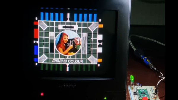
Recreating A Camera Shot

People rolling off shields and spears clashing against swords as the camera zooms in and out wildly makes the hallmark action sequences in the movie 300 so iconic. Unfortunately, achieving this effect wasn’t particularly easy. Three cameras were rolling, each with a different lens (100mm, 50mm, and 21mm) to capture a different view of the same scene. In post-production, you can dramatically switch between the three cameras since the shot is synchronized. The folks over at [Corridor Crew] wanted to recreate the effect, but rather than create a custom mount to hold three expensive cameras, they 3d printed a custom mount to hold three costly smartphones.

While there are three cameras on the back of most phones, most phones can’t shoot in slo-mo from all cameras simultaneously. So they would need a rig to hold three phones. The first design was simple and just brackets to hold phones. While nice and sturdy, getting the phones in or out wasn’t easy, and getting to the record button was tricky. iPhones have this handy little magnetic ring on the back. They had a bracket that worked pretty well after a few iterations on the design and some printer issues. Since each camera has optical image stabilization, it is easy for the lenses to get out of alignment, which can mar the shot. However, they somewhat covered up the effect in post. With a working prototype, the only thing left to do was to slice a bunch of piñatas in slow motion with a thrumming soundtrack.

We love seeing exciting camera setups and iterating to find something that works. This dual-camera setup has a very different goal and tries to lean into the parallax effect rather than hide it. Video after the break.
Continue reading “Recreating A Camera Shot”

side by side of upscaling in the AGI engine

Upscaling The Sierras

If you played many games back in the mid-80s to 90s, you might remember the iconic graphics from Sierra’s Online Adventure Games. They were brightly colored (16 colors) and dynamic with some depth. To pay homage, [eviltrout] worked to upscale the images. Despite being rendered at 160×200 at 16 colors and then stretched, storing all those bitmaps even at only 4 bits per pixel would take all the storage available on the floppy disk. The engineers on the game decided instead to take a vector approach to a raster problem.

When [eviltrout] came through to try and upscale the backgrounds, he started by writing some code to extract the draw commands from the engine of the game, known as Adventure Game Interpreter (AGI). Comparing the vector commands to equivalent PNG versions with the best compression, the AGI vector versions were around half the size. Not bad for a couple of game developers in the 80s. Since it is all vector commands under the hood, it should be relatively simple to draw them at a much higher resolution. At least, that’s what he thought. The first issue was with flood fills. Since the canvas is larger, there are gaps between lines, and the flood escapes. A few approaches were taken, such as using a low-resolution reference and marching squares, but neither was satisfactory. Eventually, [eviltrout] expanded flood fills and used thicker lines. He also first rendered to a lower resolution and connected neighboring lines of the same color. Finally, he used ImageMagick to denoise white specs in the output.

We find the effect charming, but some might say you’re distorting art into what the artist never intended to be. But, as with all graphical enhancements, some artistic liberties are being taken without the original artist involved. The code is available on GitHub under an MIT license. Video after the break.

Continue reading “Upscaling The Sierras”

See How To Effectively Use A Green Screen In A Limited Space

Virtual green screens are pretty neat, but for results, nothing beats the real thing. But what if you have limited space? [Fred Emmott] had about 30 inches behind his desk to work with, and shares what it took to make a green screen work reliably in a limited space.

Even (and consistently deployable) lighting is even more important than the camera.

When it comes right down to it, the fundamentals of camera work (lighting, angles, and so on) are unchanged, but hanging a green screen only 30 inches behind one’s desk does make it a bit more challenging to dial in the right environment. In addition, [Fred] wanted a solution that could be deployed and packed away without much of a hassle, and without taking up too much storage space. He ended up using a collapsible green screen that can be pulled straight up and out from its container, similar to portable stand-up banners used at trade shows.

As for the camera end of things, [Fred] found that reliable, quality lighting was critically important, even more so than the camera used. For repeatable results, he suggests disabling any automatic features (such as low light enhancement, or auto white balance, and settings of that nature) and to use LED lighting in the ‘daylight’ range for illumination and fill. The key to good green screen results is to light things evenly, and this is a bit more challenging when working in such a tight space.

To deal with this, [Fred] suggests lights that can be easily repositioned, and put them as far back from things as you can. Get the lighting as even as possible, then adjust your software to match ([Fred] uses OBS Studio) for best results. Once that’s done, it can be more easily set up and torn down with minimal fiddling.

Computers sure make all this much easier than it was back in the day, and if you’re curious, here is all about how green screens were done before the digital age.

Someone setting down an arUco tag

Make Your Own Virtual Set

An old adage says out of cheap, fast, and good, choose two. So if you’re like [Philip Moss] and trying to make a comedy series on a limited budget rapidly, you will have to take some shortcuts to have it still be good. One shortcut [Philip] took was to do away with the set and make it all virtual.

If you’ve heard about the production of a certain western-style space cowboy that uses a virtual set, you probably know what [Philip] did. But for those who haven’t been following, the idea is to have a massive LED wall and tracking of where the camera is. By creating a 3d set, you can render that to the LED wall so that the perspective is correct to the camera. While a giant LED wall was a little out of budget for [Philip], good old green screen fabric wasn’t. The idea was to set up a large green screen backdrop, put some props in, get some assets online, and film the different shots needed. The camera keeps track of where in the virtual room it is, so things like calculating perspective are easy. They also had large arUco tags to help unreal know where objects are. You can put a wall right where the actors think there’s a wall or a table exactly where you put a table covered in green cloth.

Initially, the camera was tracked using a Vive tracker and LiveLink though the tracking wasn’t smooth enough while moving to be used outside of static shots. However, this wasn’t a huge setback as they could move the camera, start a new shot, and not have to change the set in Unreal or fiddle with compositing. Later on, they switched to a RealSense camera instead of the Vive and found it much smoother, though it did tend to drift.

The end result called ‘Age of Outrage’, was pretty darn good. Sure, it’s not perfect, but it doesn’t jump out and scream “rendered set!” the way CGI tv shows in the 90’s did. Not too shabby considering the hardware/software used to create it!

Monochrome LCD Video Hacks Galore!

[Wenting Zhang] is clearly a fan of old school STN LCD displays, and was wondering how various older portable devices managed to drive monochrome LCDs panels with multiple grey levels. If the display controller supports multiple bits per pixel, it can use various techniques, such as PWM, in order to produce a pseudo-grayscale image. But, what if you have a monochrome-only display controller? With a sufficiently high pixel clock, can you use software on the application side of things to flip those pixels in such a manner as to give a reasonable looking grayscale image?

Simple dithering – don’t look too close!
PDM greyscale approximation in a 1-bit display

[Wenting] goes through multiple techniques, showing the resulting image quality in a clear, systematic manner. The first idea is to use a traditional dithering technique. For each pixel, it is set to black if the grey value is below some threshold. The resulting error value, is then propagated to neighbouring pixels. This error diffusion process smears the error out over the whole display, so spatially speaking, on average the pixel values correspond roughly to the original gray values. But, the pixels themselves are still either on or off. This isn’t quite enough. The next idea is to PWM the individual pixels over multiple frames, to approximate different grey levels. But, that gives a worst case effective refresh rate of 8 Hz with a PWM period of 15 frames, at 120 fps, and that flickers. Badly. One way to mitigate that is to switch to PDM (pulse density modulation) which selects different length sequences to give the same duty cycle but at higher frequency, at least for some grey values. Slightly better, but there’s more that can be done. Continue reading “Monochrome LCD Video Hacks Galore!”

Retrotechtacular: How Television Worked In The 1950s

Watching television today is a very different experience from that which our parents would have had at our age, where we have high-definition digital on-demand streaming services they had a small number of analogue channels serving linear scheduled broadcasting. A particular film coming on TV could be a major event that it was not uncommon for most of the population to have shared, and such simple things as a coffee advert could become part of our common cultural experience. Behind it all was a minor miracle of synchronised analogue technology taking the signal from studio to living room, and this is the subject of a 1952 Coronet film, Television: How It Works!  Sit back and enjoy a trip into a much simpler world in the video below the break.

Filming a TV advert: 1950s housewife sells cooker
Production values for adverts had yet to reach their zenith in the 1950s.

After an introduction showing the cultural impact of TV in early-50s America there’s a basic intro to a cathode-ray tube, followed by something that may be less familiar to many readers, the Image Orthicon camera tube that formed the basis of most TV signals of that era.

It’s written for the general public, so the scanning raster of a TV image is introduced through the back-and-forth of reading a book, and then translated into how the raster is painted on the screen with the deflection coils and the electron gun. It’s not overly simplified though, for it talks about how the picture is interlaced and shows how a synchronisation pulse is introduced to keep all parts of the system working together.

A particularly fascinating glimpse comes in a brief mention of the solid copper co-axial cable and overland microwave links used to transmit TV signals across country, these concrete towers can still be seen today but they no longer have the colossal horn antennas we can see in the film.

A rather obvious omission in this film is the lack of any mention of colour TV, as while it would be late 1953 before the NTSC standard was formally adopted and early 1954 before the first few colour sets would go on sale. Colour TV would have been very much the Next Big Thing in 1952, but with no transmissions to watch and a bitter standards war still raging between the field-sequential CBS system and RCA’s compatible dot-sequential system that would eventually evolve into the NTSC standard  it’s not surprising that colour TV was beyond the consumer audience of the time.

Thus we’re being introduced to the 525-line standard which many think of as NTSC video, but without the NTSC compatible colour system that most of us will be familiar with. The 525-line analogue standard might have disappeared from our living rooms some time ago, but as the last few stations only came off-air last year we’d say it had a pretty good run.

We like analogue TV a lot here at Hackaday, and this certainly isn’t the first time we’ve gone all 525-line. Meanwhile for a really deep dive into the inner workings of TV signal timing, get ready to know your video waveform.

Continue reading “Retrotechtacular: How Television Worked In The 1950s”

partially finished print, with the embedded animation

Flip Book Animations On The Inside Of 3D Prints

We’ve all seen 3D printed zoetropes, and drawn flip book animations in the corner of notebooks. The shifting, fluid shape of the layers forming on a 3D printer is satisfying. And we all know the joy of hidden, nested objects.

Hackaday alumnus [Caleb Kraft] has a few art pieces that all reflect all these. He’s been making animations by recording a 3D printer. The interesting bit is that his print is made of two objects. An outer one with normal infill that gives a solid form, and a layer cake like inner one with solid infill. It’s documented in this video on YouTube.

CAD model of the stack of frames

There are lots of things to get right.  The outer object needs to print without supports. The thickness of the “layer cake” layers determines the frame rate. I had to wonder how he triggered the shutter  when the head wasn’t in the way.

His first, experimental, piece is the classic ‘bouncing ball’ animation, inside a ball, and his mature piece is Eadward Muybridge’s “The Horse, In Motion” inside a movie camera.

We’ve covered [Caleb Kraft] before, of course. His Moon On A Budget piece is wonderful.  And we’ve covered a number of 3D printer animations. and 3D zoetropes.  We particularly were drawn to this one.

Thanks [jmc] for the tip!

Continue reading “Flip Book Animations On The Inside Of 3D Prints”