Hackers, Fingerprints, Laptops, And Stickers

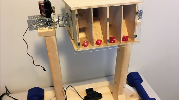
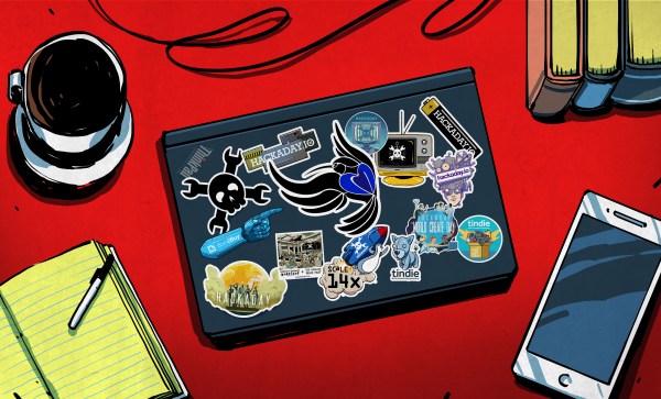
A discussion ensued about our crazy hacker ways the other night. I jokingly suggested that with as many stickers as we each had on our trusty companion machines, they might literally be as unique as a fingerprint. Cut straight to nerds talking too much math.

First off, you could wonder about the chances of two random hackers having the same sticker on their laptop. Say, for argument’s sake, that globally there are 2,000 stickers per year that are cool enough to put on a laptop. (None of us will see them all.) If a laptop lasts five years, that’s a pool of 10,000 stickers to draw from. If you’ve only got one sticker per laptop, that’s pretty slim odds, even when the laptops are of the same vintage.

Real hackers have 20-50 stickers per laptop — at least in our sample of “real hackers”. Here, the Birthday Paradox kicks in and helps us out. Each additional sticker provides another shot at matching, and an extra shot at being matched. So while you and I are unlikely to have the same birthday, in a room full of 42 people, it’s 90% likely that someone will have their birthday matched. With eight of us in the room, that’s 240 stickers that could match each other. (9999 / 10000) ^ (240 * 210 / 2) = about an eight percent chance of no match, so a better than 90% chance that we’d have at least one matching sticker.

But that doesn’t answer the original question: are our be-stickered laptops unique, like fingerprints or snowflakes? There, you have to match each and every sticker on the laptop — a virtually impossible task, and while there were eight of us in the room, that’s just not enough to get any real juice from the Birthday Paradox. (1/10,000) ^ 30 = something with -120 in the exponent. More than all the atoms in the universe, much less hackers in a room, whether you take things to the eighth power or not.

I hear you mumbling “network effects”. We’ve all gone to the same conferences, and we have similar taste in stickers, and maybe we even trade with each other. Think six degrees of separation type stuff. Indeed, this was true in our room. A few of us had the same stickers because we gave them to each other. We had a lot more matches than you’d expect, even though we were all unique.

So while the math for these network effects is over my head, I think it says something deeper about our trusty boxen, their stickers, and their hackers. Each sticker also comes with a memory, and our collected memories make us unique like our laptops. But matching stickers are also more than pure Birthday Paradoxes, they represent the shared history of friends.

Wear your laptop stickers with pride!

What Really Goes Wrong With Your Tablet

We’ve all seen our share of consumer electronic devices that need repair. It’s inevitable that, however well-cared-for it will be, there’s always the unforseen that brings its life to an end. Many of us will be using devices we’ve repaired ourselves, because often other people’s useless broken electronics can be our free stuff when we know how to fix them and they don’t. This is the arena the Restart Project operate in, as through their Restart Parties they provide repair services to save unnecessary landfill. Over nearly a decade in operation they’ve fixed a huge number of faulty items, and now they’re releasing some data and have analysed common fault modes and barriers to repair for some categories.

We’re restricted to tablets, printers, and batteries, and while many of the problems  are the wear-and-tear such as tablet screens, power supplies, charging connectors, and paper feeds that most of us would expect, it’s the barriers to repair which the Restart Project are keen to draw attention to. Products that are near-impossible to open without damage, parts such as batteries which are difficult to remove, and unavailability of spares. It’s to become part of their campaigning for legal repairability standards across Europe.

Aside from their own analysis, the full data is all available for download should you have any extra insights. We’ve made our position on this matter very clear indeed.

COVID-19 Statistics: Reading The Tea Leaves

If you’ve been tracking the spread of the COVID-19 pandemic around the world, as we have, you’ve doubtless seen a lot of statistics. The raw numbers look shocking, and in many cases they are, but as always it’s crucially important to ask yourself what the numbers mean.

For instance, our own Tom Nardi put together a counter that displays the total number of COVID-19 cases in the US. It’s a cool project that puts together some web-scraping, a nice OLED screen, and a 3D-printed network display. When this is all over, it can be easily re-trained to show some other statistic of interest, and it’s a great introduction to a number of web APIs. However, it’s looking at the wrong number.

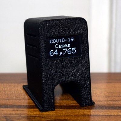
Let me explain. Diseases spread exponentially: the more people who have it, the more people are spreading it. And exponential curves all look the same when you plot out their instantaneous values — the raw number of COVID-19 cases. Instead, what distinguishes one exponential from another is the growth parameter, and this is related to the number of new cases per day, or more correctly, to the day-to-day change in new cases.

If left unchecked, and especially in the early stages of spread, the number of new cases grows every day. But as control efforts, mainly social distancing, take effect, the rate at which the number of new cases can slow, or even go negative. That’s the plan, anyway.

As is very well explained by this video from 3 Blue, 1 Brown, if this were a naturally spreading epidemic, the point at which the new cases just starts to decline marks the halfway point in the course of the disease. Here, we’re hoping that particularly strict quarantining procedures will cut this run even shorter, but if you’re interested in how the disease is spreading, the point when daily new infections turns around is what you’re looking for.

Why not put the daily difference in new cases on your desktop, then? These numbers are noisy, and the difference jumps all around. To be serious, you would probably want to put a moving average on the new cases figure, and look at that difference. Or simply show the new cases instead and look for it to drop for a few days in a row.

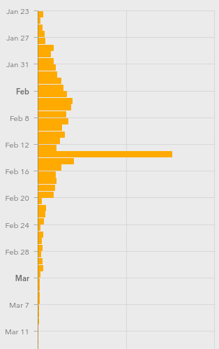
Still, this won’t be a perfect measure. For starters, COVID-19 seems to incubate for roughly a week without symptoms. This means that whatever numbers we have, they’re probably a week behind the actual situation. We won’t see the effects of social distancing for at least a week, and maybe more.

Further complicating things is the availability of tests, human factors like weekends when more people get tested but fewer government reporting offices are open, timezones, etc. (What happened on Feb. 13?)

I’m not going to go so far as to say that the COVID-19 stats that we see are useless — actually far from it. But if you’re going to armchair quarterback this pandemic, do it right. Plot out the daily new cases, maybe apply a little smoothing, at least in your head, and realize that whatever you’re seeing now probably represents what happened last week.

When you finally see the turning point, you may celebrate a little, because that means the halfway point was a week ago. We’ve seen it happen in China around Feb 2, and I’m looking forward to it happening here. I hope it happens wherever you are, and soon.

We will get through this. Stay safe, all. And keep yourself uninfected to keep others uninfected.

This article is part of the Hackaday.com newsletter, delivered every seven days for each of the last 212 weeks or so. It also includes our favorite articles from the last seven days that you can see on the web version of the newsletter.

Want this type of article to hit your inbox every Friday morning? You should sign up!

Florence Nightingale: The Lady With The Data

When you think of Florence Nightingale, you probably imagine a nurse with a lamp, comforting soldiers. Indeed, Florence is considered the mother of modern nursing. But she also made serious contributions in statistical data analysis, and used the diagram named after her, the Nightingale rose diagram, to convince the British Parliament to enact sanitation reforms that saved hundreds of thousands, if not millions, of lives.

During the Crimean war, Florence worked around the clock as head nurse in an overcrowded field hospital. But she also found time to create graphs to illustrate the terrible conditions of that field hospital to members of British Parliament. The sanitation reforms she led greatly improved the life of the soldiers in battle, and widespread adoption of her hygienic practices vastly reduced mortality rates of humanity in general.

Continue reading “Florence Nightingale: The Lady With The Data”

How Random Is Random?

Many languages feature a random number generator library for help with tasks like rolling a die or flipping a coin. Why, you may ask, is this necessary when humans are perfectly capable of randomly coming up with values?

[ex-punctis] was curious about the same quandary and decided to code up an experiment to test the true randomness of human. A script guesses the user’s next input from two choices, keeping a tally in the JavaScript backend that holds on to the past five choices. If the script guesses correctly, they take $1 from the user. Otherwise, the user earns $1.05.

The data from gathered from running the script with 200 pseudo-random inputs 100,000 times resulted in a distribution of correct guess approximately normal (µ=50% and σ=3.5%). The probability of the script correctly guessing the user’s input is >57% from calculating µ+2σ. The result? Humans aren’t so good at being random after all.

It’s almost intuitive why this happens. Finger presses tend to repeat certain patterns. The script already has a database of all possible combinations of five presses, with a counter for each combination. Every time a key is pressed, the latest five presses is updated and the counter increases for whichever combination of five presses this falls under. Based on this data, the script is able to make a prediction about the user’s next press.

In a follow-up statistic analysis, [ex-punctis] notes that with more key presses, the accuracy of the script tended to increase, with the exception of 1000+ key presses. The latter was thought to be due to the use of a psuedo random number generator to achieve such high levels of engagement with the script.

Some additional tests were done to see if holding shorter or longer sequences in memory would account for more accurate predictions. While shorter sequences should theoretically work, the risk of players keeping a tally of their own presses made it more likely for the longer sequences to reduce bias.

There’s a lot of literature on behavioral models and framing effects for similar games if you’re interested in implementing your own experiments and tricking your friends into giving you some cash.

Abraham Wald’s Problem Solving Lesson Is To Seek What’s Not There

You may not know the name Abraham Wald, but he has a very valuable lesson you can apply to problem solving, engineering, and many other parts of life. Wald worked for the Statistical Research Group (SRG) during World War II. This was part of a top secret organization in the United States that applied elite mathematical talent to help the allies win the war. Near Columbia University, mathematicians and computers — the human kind — worked on problems ranging from how to keep an enemy plane under fire longer to optimal bombing patterns.

One of Wald’s ways to approach problem was to look beyond the data in front of him. He was looking for things that weren’t there, using their absence as an additional data point. It is easy to critique things that are present but incorrect. It is harder to see things that are missing. But the end results of this technique were profound and present an object lesson we can still draw from today.

Continue reading “Abraham Wald’s Problem Solving Lesson Is To Seek What’s Not There”

Automated Dice Tester Uses Machine Vision To Ensure A Fair Game

People take their tabletop games very, very seriously. [Andrew Lauritzen], though, has gone far above and beyond in pursuit of a fair game. The game in question is Star War: X-Wing, a strategy wargame where miniature pieces are moved according to rolls of the dice. [Andrew] suspected that commercially available dice were skewing the game, and the automated machine-vision dice tester shown in the video after the break was the result.

The rig is a very clever design that maximizes the data set with as little motion as possible. The test chamber is a box with clear ends that can be flipped end-for-end by a motor; walls separate the chamber into four channels to test multiple dice on each throw, and baffles within the channels assure randomization. A webcam is positioned below the chamber to take a snapshot of each “throw”, which is then analyzed in OpenCV. This scheme has the unfortunate effect of looking at the dice from the table’s perspective, but [Andrew] dealt with that in true hacker fashion: he ignored it since it didn’t impact the statistics he was interested in.

And speaking of statistics, he generated a LOT of them. The 62-page report of results from his study is an impressive piece of work, which basically concludes that the dice aren’t fair due to manufacturing variability, and that players could use this fact to cheat. He recommends pooled sets of dice to eliminate advantages during competitive play. 

This isn’t the first automated dice roller we’ve seen around these parts. There was the tweeting dice-bot, the Dice-O-Matic, and all manner of electronic dice throwers. This one goes the extra mile to keep things fair, and we appreciate that.

Continue reading “Automated Dice Tester Uses Machine Vision To Ensure A Fair Game”