An animation shows an open document in LibreOffice Write. In the document are some hexadecimal opcodes. The operator selects these opcodes and changes their font to Z80 Sans, at which point they are displayed as assembly mnemonic codes.

Disassembling Opcodes With A Font

Those who stay into the forbidden realm of font rendering quickly learn how convoluted and arcane it can be – LaTeX is a fully Turing-complete programming language, Unicode has over eighty invisible characters, and there are libraries that let you execute WebAssembly in a font. A great example of a font’s hidden capabilities is Z80 Sans, a font that disassembles Z80 opcodes to assembly mnemonics.

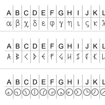
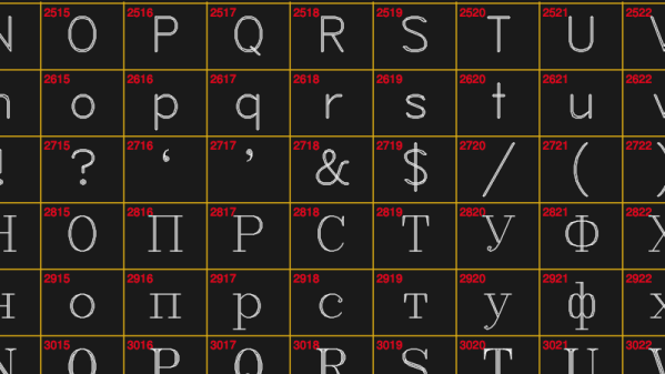
If one pastes Z80 opcodes into a word processor and changes their font to Z80 Sans, the codes are rendered as their assembly mnemonics. The font manages this by abusing the Glyph Substitution Table and Glyph Positioning Table, two components of the OpenType standard. Fonts define relations between characters (internal representations used by the computer, such as ASCII and Unicode) and glyphs (the graphics actually displayed).

In some cases, though, the way a character is displayed depends on where it appears in a word, or what appears around it (Arabic characters are a common example, but an example from English is the ligature “æ”). Z80 Sans defines all the possible glyphs for each nibble of the opcodes, then used a recursive descent parser to generate substitution rules which display the correct glyphs in context.

For a deeper dive into the pitfalls of text graphics, check out this font rendering engine written for a hobby OS. You can also use fonts to play games or talk to an LLM.

Ask Hackaday: What Goes Into A Legible Font, And Why Does It Matter?

Two patent front pages, on the left American with a serif font, on the right British with a sans serif font.
American and British patents, for comparison.

There’s an interesting cultural observation to be made as a writer based in Europe, that we like our sans-serif fonts, while our American friends seem to prefer a font with a serif. It’s something that was particularly noticeable in the days of print advertising, and it becomes very obvious when looking at government documents.

We’ve brought together two 1980s patents from the respective sources to illustrate this, the American RSA encryption patent, and the British drive circuitry patent for the Sinclair flat screen CRT. The American one uses Times New Roman, while the British one uses a sans-serif font which we’re guessing may be Arial. The odd thing is in both cases they exude formality and authority to their respective audiences, but Americans see the sans-serif font as less formal and Europeans see the serif version as old-fashioned. If you thought Brits and Americans were divided by a common language, evidently it runs much deeper than that. Continue reading “Ask Hackaday: What Goes Into A Legible Font, And Why Does It Matter?”

Engraving A Puzzle Box? Here’s A Collection Of Single-Line Cryptex Fonts

Here’s a neat resource from [MSRaynsford] that is worth bookmarking for anyone who gets creative with laser engravers, CNC routers, or drawing robots: SVGFonts are single-line symbol fonts that [MSRaynsford] created for his laser-cut and engraved cryptex puzzle boxes. They provide an easy way to engrave text as symbols.

Single-line fonts for engraving that include a runic-looking alphabet, a Greek-inspired set, and two symbol sets based on Flag Semaphore.

CNC engraving of letters and symbols is one of those things that seems simple, but is actually more complex than it may appear. It is often desirable to use a tool to engrave symbols with a single line, in much the same way a person would write them if using a pen. But fonts and art for letters and numbers aren’t normally a single line. Thankfully there is a solution in the form of Hershey text, an extension for which is included in Inkscape. It turns out that Hershey Fonts have their origin back in the 1960s, when the changing landscape of electronics and industry opened new opportunities and demanded new solutions.

That’s why, when [MSRaynsford] needed fonts in different styles and symbols for creating his puzzle boxes, he had to design them himself and they had to be single-line vector art, just like Hershey Text. The small collection includes English letters designed to resemble a runic alphabet, a Greek-inspired series, and two coded alphabets based on flag semaphore.

Grab ’em on GitHub, because you never know when you’ll need to make a quick cryptex.

Cracking Open The Prince Floppy After The Purple Reign

Readers of a certain vintage will no doubt remember the time when Prince eschewed his royal position and became an unpronounceable symbol. People had no choice but to refer to him as TAFKAP, The Artist Formerly Known As Prince, and members of the music press were sent a 3.5″ floppy disk with a font file containing a single character — that gender-transcending shape that would soon become another one of Prince’s guitars. But it’s 2021, and now you can get it from the Internet Archive. Fun fact: the file wasn’t ever locked down. In fact, the symbol was available on Prince’s Compuserve and fan club CD-ROM.

While some people trawl auction sites for overalls and weird keyboards, others look for ridiculous items from the zeitgeist, like a copy of this floppy. Take [Anil Dash] for instance. [Anil] finally pulled the trigger after 15 years of debating this particular purchase. [Anil]’s interest was reignited after reading this analysis of whether the symbol could ever be put into Unicode. (Between being trademarked, a logo, and a personal character, it’s ineligible for inclusion.)

Earlier this week, [Anil] teamed up with Adafruit to extract the data from the floppy. The Twitter thread that ensued led readers to another old source of the font — the 1994 game Prince Interactive. We wonder if they broke out the oscilloscope, though it doesn’t look like it.

Thanks for the tip, [pt and limor]!

Hershey Fonts: Not Chocolate, The Origin Of Vector Lettering

Over the past few years, I kept bumping into something called Hershey fonts. After digging around, I found a 1967 government report by a fellow named Dr. Allen Vincent Hershey. Back in the 1960s, he worked as a physicist for the Naval Weapons Laboratory in Dahlgren, Virginia, studying the interaction between ship hulls and water. His research was aided by the Naval Ordnance Research Calculator (NORC), which was built by IBM and was one of the fastest computers in the world when it was first installed in 1954.

The NORC’s I/O facilities, such as punched cards, magnetic tape, and line printers, were typical of the era. But the NORC also had an ultra-high-speed optical printer. This device had originally been developed by the telecommunications firm Stromberg-Carlson for the Social Security Administration in order to quickly print massive amounts of data directly upon microfilm.

Continue reading “Hershey Fonts: Not Chocolate, The Origin Of Vector Lettering”

Lasering Axonometric Fonts

I am something of an Inkscape fan. If you’re not familiar with the application, it’s like an Open Source version of Adobe Illustrator. Back when I was a production artist I’d been an Illustrator master ninja but it’s been four years and my skills are rusty. Plus, Inkscape is just enough different in terms of menus and capabilities that I had a hard time adapting.

So I created some wooden lettering with the help of Inkscape and a laser cutter, and I’m going to show you how I did it. If you’re interested in following along with this project, you can find it on Hackaday.io.

While playing around with Inkscape, I noticed you can create a variety of grids, including axonometric grids. This term refers to the horizon lines in an orthographic projection. In other words, it helps make things look 3D by providing perspective lines.

Continue reading “Lasering Axonometric Fonts”

New Fonts For GEDA PCB Tool

In the open-source world, there are two main choices for PCB design: KiCad and gEDA. But if you’re tired of the boring Hershey fonts telling you which resistor is which, or if you need to comply with ISO 3098, there’s one clear choice: PCB-RND, the improved fork of gEDA’s PCB tool. Why?

Because PCB-RND now supports osifont, which supports a ridiculous number of languages. In addition to the usual suspects, like Azerbaijani through Vietnamese, support has also been added for legacy users, including those of Middle Earth, who build PCBs that can only be read when the thrush knocks by the setting sun of the last light on Durin’s Day.

And they haven’t stopped there. Looking forward to the Treaty of Organia in 2267, you can now create PCBs that are fully plqaD-HaSta compliant.

We’re glad to see these important steps made toward reaching out to underserved PCB-constructing communities. However, we’re appalled at the continuing lack of support for Rihannsu. This will have to be rectified by anyone who wants to push their projects in the Beta Quadrant.