A shot of the underside of a "One Fast Cat" cat wheel with an installed ESP8266 and hall effect sensors attached to the base.

Spy On Your Cat To Make Sure It Gets Its Paws In

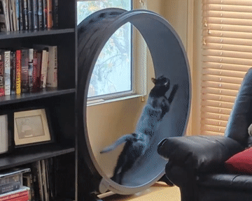
[Scott Cutler] has a young cat, [Cygnus], that loves to run on a cat wheel and [Scott] had some some important questions about [Cygnus]’s usage of the cat wheel like, how often it’s used, what direction is preferred and how fast does [Cygnus] go. To answer these questions, [Scott] put some telemetry sensors onto the cat wheel and analyzed the results.

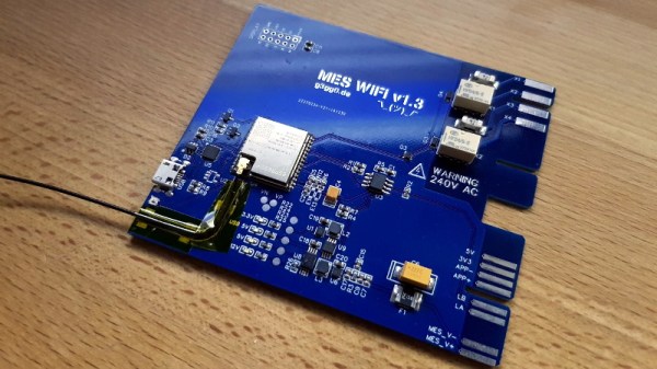
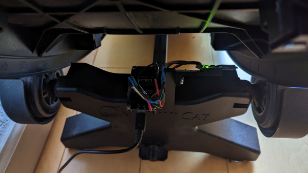
An ESP8266 microcontroller and two 3144E hall effect modules were used to sense eight magnets glued onto the outer housing of a “One Fast Cat” cat wheel. [Scott] installed the ESP8266 and hall effect modules onto the base support for the wheels, using 3D printed brackets to secure them.

For the software side, the ESP8266 attaches an interrupt handler whenever a sensor passes by, recording a window of three previous measurements for valid sample determination and, if accepted, uses the time between samples to infer direction and speed. The ESP8266 connects to a pre-configured local WiFi network and has a telnet interface to extract stored log information, in the form of JSON data.

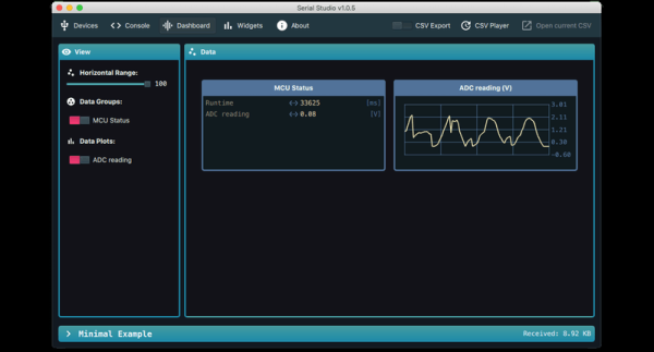
[Scott] has some nice graphs and other data visualizations on [Cygnus]’s usage, including a preference for running at 3 AM, achieving a maximum speed of 14 mph and an average of 4 seconds per run. The source is available on GitHub and the STL files are available embedded in [Scott]’s write-up. We’ve featured cat exercise trackers before with a giant hamster wheel outfitted with a Raspberry Pi and it’s nice to see some options that allow for a retrofit option in addition to a complete DIY solution.

Serial Studio: Easily Visualise And Log Serial Data

Outputting data from a microcontroller over a serial port is convenient and easy, but formatting, visualizing, and analyzing the data can be tedious and frustrating. [Alex Spataru] knows this all too well, having spent too many hours building and debugging custom dashboards. To save himself and others the same frustration in the future, he created Serial Studio, a tool for quickly building dashboards for serial data.

The only input required for Serial Studio to create a dashboard is a simple JSON structure specifying the data’s format, and how it should be grouped and displayed. Originally Serial Studio required all the JSON data to be sent over serial, which is fine for simple data but quickly becomes cumbersome for more complex applications. To solve this, [Alex] added a feature allowing the JSON document with the format information loaded from the computer, while only the data is sent over serial.

Serial Studio includes several visualization options, including raw line graphs, bar/level indicator, dial indicator, the artificial horizon for IMU data, or a map widget. It can also output the formatted data to a CSV file for further analysis in other software. A console window is also included for viewing raw data or debugging purposes. See the usage demo after the break.

We like Serial Studio’s ease of use and adaptability, and we’ll likely use it for our own projects in the future. It is compatible with Linux, Windows, and Mac thanks to the Qt framework, and the code is open-source and available on GitHub.

If you’ve ever watched one of the BPS.Space model rocket launch videos, you’ll know how critical data logging, visualization and analysis is for [Joe Barnard]’s work. Serial Studio is perfect for such applications, and [Alex] used it extensively for simulated satellite competitions at his university. Continue reading “Serial Studio: Easily Visualise And Log Serial Data”

Heater Joins The Internet Of Things With ESP32 Board

The wood-burning heater [g3gg0] has at home works perfectly, except for one flaw: the pellet reservoir needs to be manually refilled every few days. Humans being notoriously unreliable creatures, this critical task is sometimes overlooked, which naturally leads to literally chilling results.

With automatic fill systems expensive and difficult to install, [g3gg0] wanted to find some kind of way for the heater to notify its caretakers about any potential fault conditions. Not just the fact that it was out of fuel (though that would naturally be the most common alert), but any other issue which would potentially keep the heater from doing it’s job. In short, the heater was going to get a one-way ticket to the Internet of Things.

As it turns out, this task was not quite as difficult as you might expect. The Windhager heater already had upgrade bays where the user could insert additional modules and sensors, as well as a rudimentary data bus over RS-485. All [g3gg0] had to do was tap into this bus, decode what the packets contained, and use the information to generate alerts over the network. The ESP32 was more than up to the task, it just needed a custom PCB and 3D printed enclosure that would allow it to slot into the heater like an official expansion module.

When an interesting message flashes across the bus, the ESP32 captures it and relays the appropriate message to an MQTT broker. From there, the automation possibilities are nearly endless. In this case, the heater’s status information is being visualized with tools like Grafana, and important alerts are sent out to mobile devices with PushingBox. With a setup like this, the Windhager will never go hungry again.

Continue reading “Heater Joins The Internet Of Things With ESP32 Board”

Simulate Your World With Hash.ai

We will admit that we often throw together software simulations of real-world things, but we’ll also admit they are usually quick and dirty and just dump out text that we might graph in a spreadsheet or using GNUPlot. But with Hash.ai, you can quickly generate simulations of just about anything quickly and easily. The simulations will have beautiful visualizations and graphs, too. The tool works with JavaScript or Python and you don’t have to waste your time writing the parts that don’t change.

The web-based tool works on the idea of agents. Each agent has one or more behaviors that run each time step. In the example simulation, which models wildfires in forests, the agent is named forest, although it really models one virtual tree. There’s also a behavior called forest which controls the tree’s rate of growth and chance of burning based on nearby trees and lightning. Other behaviors simulate a burning tree and what happens to a tree after burning — an ember — which may or may not grow back.

Continue reading “Simulate Your World With Hash.ai”

The Heat Of The Moments – Location Visualization In Python

Have you ever taken a look at all the information that Google has collected about you over all these years? That is, of course, assuming you have a Google account, but that’s quite a given if you own an Android device and have privacy concerns overruled by convenience. And considering that GPS is a pretty standard smartphone feature nowadays, you shouldn’t be surprised that your entire location history is very likely part of the collected data as well. So unless you opted out from an everchanging settings labyrinth in the past, it’s too late now, that data exists — period. Well, we might as well use it for our own benefit then and visualize what we’ve got there.

Location data naturally screams for maps as visualization method, and [luka1199] thought what would be better than an interactive Geo Heatmap written in Python, showing all the hotspots of your life. Built around the Folium library, the script reads the JSON dump of your location history that you can request from Google’s Takeout service, and overlays the resulting heatmap on the OpenStreetMap world map, ready for you to explore in your browser. Being Python, that’s pretty much all there is, which makes [Luka]’s script also a good starting point to play around with Folium and map visualization yourself.

While simply just looking at the map and remembering the places your life has taken you to can be fun on its own, you might also realize some time optimization potential in alternative route plannings, or use it to turn your last road trip route into an art piece. Just, whatever you do, be careful that you don’t accidentally leak the location of some secret military facilities.

[via r/dataisbeautiful]

Watch Earthquake Roll Across A Continent In Seismograph Visualization Video

If your only exposure to seismologists at work is through film and television, you can be forgiven for thinking they still lay out rolls of paper to examine lines of ink under a magnifying glass. The reality is far more interesting in a field that has eagerly adopted all available technology. A dramatic demonstration of modern earthquake data gathering, processing, and visualization was Tweeted by @IRIS_EPO following a central California quake on July 4th, 2019. In this video can see the quake’s energy propagate across the continental United States in multiple waves of varying speed and intensity. The video is embedded below, but click through to the Twitter thread too as it has a lot more explanation.

The acronym IRIS EPO expands out to Incorporated Research Institutions for Seismology, Education and Public Outreach. We agree with their publicity mission; more people need to know how cool modern seismology is. By combining information from thousands of seismometers, we could see forces that we could not see from any individual location. IRIS makes seismic data available to researchers (or curious data science hackers) in a vast historical database or a real time data stream. Data compilations are presented in several different forms, this particular video is a GMV or Ground Motion Visualization. Significant events like the 4th of July earthquake get their own GMV page where we can see additional details, like the fact this visualization compiled data from 2,132 stations.

If this stirred up interest in seismology, you can join in the fun of networked seismic data. A simple seismograph can be built from quite humble components, but of course there are specially designed chips for the task as well.

Continue reading “Watch Earthquake Roll Across A Continent In Seismograph Visualization Video”

A Baby’s First Year In Data, As A Blanket

New parents will tell you that a baby takes a few months to acquire something close to a day/night sleep pattern, and during that time Mom and Dad also find their sleep becomes a a rarely-snatched luxury. [Seung Lee] has turned this experience into a unique data visualisation, by taking the sleep pattern data of his son’s first year of life and knitting it into a blanket.

The data was recorded using the Baby Connect app, from which it was exported and converted to JSON. This was in turn fed to some HTML/Javascript which generated a knitting pattern in a handy format that could be displayed on any mobile or portable device for knitting on the go. The blanket was then knitted by hand as a series of panels that were later joined into one, providing relief as the rows lined up.

The finished product shows very well the progression as the youngster adapts to a regular sleep pattern, and even shows a shift to the right at the very bottom as a result of a trip across time zones to see relatives. It’s both a good visualisation and a unique keepsake that the baby will treasure one day as an adult. (Snarky Ed Note: Or bring along to the therapist as evidence.)

This blanket was hand-knitted, but it’s not the first knitted project we’ve seen. How about a map of the Universe created on a hacked knitting machine?