Turn Timing Diagrams Into ASCII Art, For Friendlier Pasting

We all use text-based fields at one time or another, and being limited to ASCII only can end up being a limitation. That’s what led [Luke Wren] to create asciiwave, a fantastic tool that turns WaveDrom timing diagrams into ASCII art. Unlike images, ASCII timing diagrams are suitable for pasting into comment fields, change logs, or anywhere else that accepts text only. [Update: As the author kindly shared in the comments below, this tool’s original niche is pasting into HDL (e.g. Verilog) source code comments, where it has a special kind of usefulness.]

WaveDrom itself is a nifty JavaScript tool that we have covered before. It accepts timing diagrams expressed as JSON data, and renders nicely-readable digital timing diagrams as images directly inside one’s browser.

As cool and useful as that is, images can’t be pasted into text fields. That’s where asciiwave comes in. It reads the exact same format that WaveDrom uses, but generates an ASCII-art timing diagram instead. So if you’ve found WaveDrom useful, but wish you could generate ASCII versions, here’s your solution.

Is Your Device Actually USB 3.0, Or Is The Connector Just Blue?

Discount (or even grey market) electronics can be economical ways to get a job done, but one usually pays in other ways. [Majenko] ran into this when a need to capture some HDMI video output ended up with rather less than was expected.

Faced with two similar choices of discount HDMI capture device, [Majenko] opted for the fancier-looking USB 3.0 version over the cheaper USB 2.0 version, reasoning that the higher bandwidth available to a USB 3.0 version would avoiding the kind of compression necessary to shove high resolution HDMI video over a more limited USB 2.0 connection.

The device worked fine, but [Majenko] quickly noticed compression artifacts, and interrogating the “USB 3.0” device with lsusb -t revealed it was not running at the expected speeds. A peek at the connector itself revealed a sad truth: the device wasn’t USB 3.0 at all — it didn’t even have the right number of pins!

A normal USB 3.0 connector is blue inside, and has both sets of pins for backward compatibility (five in the rear, four in the front) like the one shown here.

A USB 3.0 connection requires five conductors, and the connectors are blue in color. Backward compatibility is typically provided by including four additional conductors, as shown in the image here. The connector on [Majenko]’s “USB 3.0” HDMI capture device clearly shows it is not USB 3.0, it’s just colored blue.

Most of us are willing to deal with the occasional glitch or dud in exchange for low prices, but when something isn’t (and never could be) what it is sold as, that’s something else. [Majenko] certainly knows that as well as anyone, having picked apart a defective power bank module to uncover a pretty serious flaw.

Who Needs Yeast When You Have Lab Equipment?

This particular story on researchers successfully making yeast-free pizza dough has been making the rounds. As usual with stories written from a scientific angle, it’s worth digging into the details for some interesting bits. We took a look at the actual research paper and there are a few curious details worth sharing. Turns out that this isn’t the first method for yeast-free baking that has been developed, but it is the first method to combine leavening and baking together for a result on par with traditional bread-making processes.

Some different results from varying the amount of pressure released during the baking process.

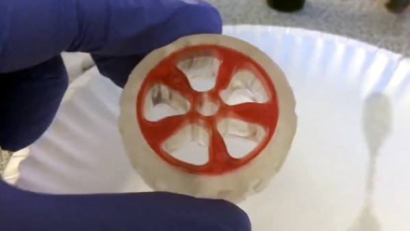
Basically, a dough consisting of water, flour, and salt go into a hot autoclave (the header image shows a piece of dough as seen through the viewing window.) The autoclave pressurizes, forcing gasses into the dough in a process similar to carbonating beverages. Pressure is then released in a controlled fashion while the dough bakes and solidifies, and careful tuning of this process is what controls how the bread turns out.

With the right heat and pressure curve, researchers created a pizza whose crust was not only pleasing and tasty, but with a quality comparable to traditional methods.

How this idea came about is interesting in itself. One of the researchers developed a new method for thermosetting polyurethane, and realized that bread and polyurethane have something in common: they both require a foaming (proofing in the case of bread) and curing (baking in the case of bread) process. Performing the two processes concurrently with the correct balance yields the best product: optimized thermal insulation in the case of polyurethane, and a tasty and texturally-pleasing result in the case of pizza dough. After that, it was just a matter of experimentation to find the right balance.

The pressures (up to 6 bar) and temperatures (145° Celsius) involved are even pretty mild, relatively speaking, which could bode well for home-based pizza experimenters.

AI-Generated Sleep Podcast Urges You To Imagine Pleasant Nonsense

[Stavros Korokithakis] finds the experience of falling asleep to fairy tales soothing, and this has resulted in a fascinating project that indulges this desire by using machine learning to generate mildly incoherent fairy tales and read them aloud. The result is a fantastic sort of automated, machine-generated audible sleep aid. Even the logo is machine-generated!

The Deep Dreams Podcast is entirely machine-generated, including the logo.

The project leverages the natural language generation abilities of OpenAI’s GPT-3 to create fairytale-style content that is just coherent enough to sound natural, but not quite coherent enough to make a sensible plotline. The quasi-lucid, dreamlike result is perfect for urging listeners to imagine pleasant nonsense (thanks to Nathan W Pyle for that term) as they drift off to sleep.

We especially loved reading about the methods and challenges [Stavros] encountered while creating this project. For example, he talks about how there is more to a good-sounding narration than just pointing a text-to-speech engine at a wall of text and mashing “GO”. A good episode has things like strategic pauses, background music, and audio fades. That’s where pydub — a Python library for manipulating audio — came in handy. As for the speech, text-to-speech quality is beyond what it was even just a few years ago (and certainly leaps beyond machine-generated speech in the 80s) but it still took some work to settle on a voice that best suited the content, and the project gradually saw improvement.

Deep Dreams Podcast has a GitLab repository if you want to see the code that drives it all, and you can go to the podcast itself to give it a listen.

Author with book

Learn All About Writing A Published Technical Book, From Idea To Print

Ever wondered what, exactly, goes into creating a technical book? If you’d like to know the steps that bring a book from idea to publication, [Sara Robinson] tells all about it as she explains what went into co-authoring O’Reilly’s Machine Learning Design Patterns.

Her post was written in 2020, but don’t let that worry you, because her writeup isn’t about the book itself so much as it is about the whole book-writing process, and her experiences in going through it. (By the way, every O’Reilly book has a distinctive animal on the cover, and we learned from [Sara] that choosing the cover animal is a slightly mysterious process, and is not done by the authors.)

It turns out that there are quite a few steps that need to happen — like proposals and approvals — before the real writing even starts. The book writing itself is a process, and like most processes to which one is new, things start out slow and inefficient before they improve.

[Sara] also talks a bit about burnout, and her advice on dealing with it is as insightful as it is practical: begin by communicating honestly how you are feeling to the people involved.

Over the years I’ve learned that people will very rarely guess how you’re feeling and it’s almost always better to tell them […] I decided to tell my co-authors and my manager that I was burnt out. This went better than expected.

There is a lot of code in the book, and it has its own associated GitHub repository should you wish to check some of it out.

By the way, [Sara] celebrated publication by making a custom cake, which you can see near the bottom of her blog post. This comes as no surprise seeing as she has previously managed to combine machine learning with her love of making cakes!

World’s Worst I/O Dock Doesn’t Deserve Elegant Fix

Even spendy commercial products can end up being lemons. This is something [Mike Buss] is familiar with, as he had the misfortune of being stuck using what he declares is the world’s worst USB hub, and it’s not even a mystery discount device from overseas: it’s an HP Thunderbolt Dock G2. It is a sort of combination I/O dock and USB hub, and it caused him no end of frustration until he “fixed” it with a crude workaround.

The problems with [Mike]’s dock come down to two major issues. The first is that the USB-C connection will, if moved even the slightest amount, instantly trigger a disconnect from the host computer. Frankly, that sounds like a defect, but that’s not all. The other issue is that the whole top of the device is actually a giant, hyper-sensitive button. Even a stern gaze seems to be enough to cause it to activate. What does the button do? It puts the host computer to sleep; something that we all agree should suffer from as few false activations as possible.

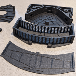
We’ll spoil the surprise by revealing that the “fix” was nothing more than putting a 3D printed enclosure around the troublesome device, as shown in the image above. Keeping the dock covered and perfectly still at least prevents the two aforementioned issues, and that’s good enough for [Mike].

The curious part of all this is just how badly the device’s design affected normal use. We’d suspect a defect or malfunction, but a cursory search of reviews online suggests [Mike]’s experience isn’t unique. It’s certainly not the first poorly-designed product we’ve seen fixed by a new enclosure, but some problems just aren’t worth the effort of a more elegant solution.

Remote MQTT Temperature Sensor Shows How It’s Done

First of all, there are definitely simpler ways to monitor remote temperatures, but [Mike]’s remote MQTT temperature sensor and display project is useful in a few ways. Not only does it lay out how to roll such a system from scratch, but it also showcases system features like solar power.

After all, if one simply wants to monitor temperature that’s easily done, but once one wishes to log those temperatures and use them to trigger other things, then rolling one’s own solution starts to get more attractive. That’s where using someone else’s project as a design reference can come in handy.

[Mike’s] solution uses two Wemos D1 boards: one with a DS18B20 temperature sensor for outdoors, and one with a small OLED screen for an interior display. The external sensor relies on a rechargeable 18650 cell and a solar panel for a hassle-free power supply, and the internal sensor (of which there can be many) has a cute enclosure and is powered by USB. On the back end, a Raspberry Pi running an MQTT gateway and Node Red takes care of the operational side of things. The whole system has been happily running for over two years.

What is MQTT? It is essentially a messaging protocol, and takes care of the whole business of reliably communicating data back and forth between IoT devices. It scales very well and doesn’t need to be hard or intimidating; our own [Elliot Williams] can tell you all about implementing it.