Programming Robots Is Hard, Figuring Out How To Make It Easier Is Harder

[Benjie Holson] is an experienced roboticist and wrote an interesting article published on IEEE Spectrum about how the idea most people have of non-roboticists is a myth, and efforts to target this group with simplified robotic frameworks tend to be doomed.

Now, let’s make a couple things absolutely clear right up front: He is not saying robots shouldn’t be easier to program, nor is he saying that non-roboticists literally do not exist (of course they do.) The issues he’s highlighting really come down to product design.
[Benjie] points out that programming robots is super hard, but it’s also hard in more than one way and for more than one reason. And when people try to create a product to make it easier, they tend to commit two big product design no-no’s: they focus on the wrong hard parts, and they design their product for a vaguely-defined audience that doesn’t really exist. That group is the mythical non-roboticist.

These are actually very solid points to make in terms of product design in general. Designing a product that solves the wrong problems for a poorly-defined group isn’t exactly a recipe for success. [Benjie]’s advice on making a truly effective and useful API framework that genuinely lowers the bar of complexity in a useful way is similarly applicable to product design in general.

His first piece of advice is not to design for poorly-defined amorphous groups. Your product should serve actual needs of actual users. If you cannot name three people you have actually spoken to who would be helped by your product, you are designing for an amorphous (and possibly imaginary) group.

The second is to design as though your users are just as smart as you are, just less tolerant of problems stemming from rough edges like compatibility and configuration issues. Remove those so that your users can get useful work done without having to re-invent the wheel, or resort to workarounds.

Robotic frameworks like ROS are useful and extensible, but whenever someone attempts to focus on creating a simplified framework, [Benjie] says they tend to step on the same rakes. It’s a mistake [Benjie] has committed himself, and see repeated by others. We think his advice is good product design advice in general, whether for designing APIs or something else.

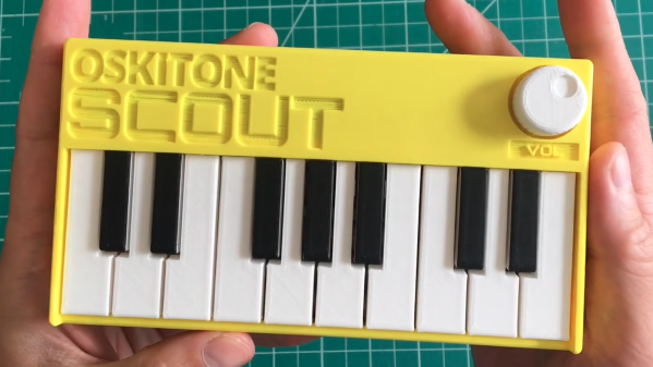
Small synth held in two hands

3D Printed Synth Kit Shares Product Design Insights

We’ve always been delighted with the thoughtful and detailed write-ups that accompany each of [Tommy]’s synth products, and the background of his newest instrument, the Scout, is no exception. The Scout is specifically designed to be beginner-friendly, hackable, and uses 3D printed parts and components as much as possible. But there is much more to effectively using 3D printing as a production method than simply churning out parts. Everything needed to be carefully designed and tested, including the 3D printed battery holder, which we happen to think is a great idea.

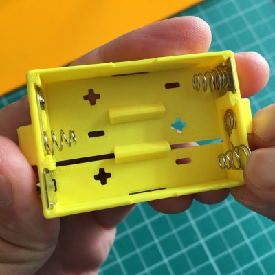
3d printed battery holder, showing inserted spring contacts
3D printed battery holder, with spring contacts inserted by hand.

[Tommy] also spends some time explaining how he decided which features and design elements to include and which to leave out, contrasting the Scout with his POLY555 synth. Since the Scout is designed to be affordable and beginner-friendly, too many features can in fact be a drawback. Component costs go up, assembly becomes less straightforward, and more complex parts means additional failure points when 3D printing.

[Tommy] opted to keep the Scout tightly focused, but since it’s entirely open-sourced with a hackable design, adding features is made as easy as can be. [Tommy] designed the PCB in KiCad and used OpenSCAD for everything else. The Scout uses the ATmega328, and can be easily modified using the Arduino IDE.

STL files can be downloaded here and all source files are on the project’s GitHub repository, which also contains detailed assembly and modification guides. Watch it in action in the video, embedded below.

Continue reading “3D Printed Synth Kit Shares Product Design Insights”

Art of 3D printer in the middle of printing a Hackaday Jolly Wrencher logo

3D Printering: Why Aren’t Enclosures Easier?

For 3D printers that aren’t already enclosed, why is easily adding a cheap and effective enclosure still not a completely solved problem? The reason is simple: unless one’s needs are very basic, enclosures are more than just boxes.

Different people need different features, printers come in different shapes and sizes, and creating something that can be both manufactured and shipped cheaply is a challenge in itself. In this article I’ll explain how those things make boxing up your printer a tougher nut to crack then may seem at first glance.

Enclosures Have Different Jobs

People have different expectations of what an enclosure’s job should be, and that determines which features are important to them and which are not. Here is a list of meaningful features for 3D printer enclosures; not everything on this list is important to everyone, but everything on this list is important to someone. Continue reading “3D Printering: Why Aren’t Enclosures Easier?”

Gain An Understanding Of Injection Molding’s Design Gotchas

When it comes to manufacturing, sheet metal and injection molding make the world go ’round. As a manufacturing method, injection molding has its own range of unique design issues and gotchas that are better to be aware of than not. To help with this awareness, [studiored] has a series of blog posts describing injection molding design issues, presented from the perspective of how to avoid and address them.

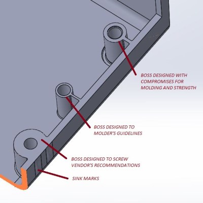
Design of screw bosses demonstrating conflict between molder’s guidelines and vendor’s recommendations. Compromising between both is a science and an art.

Because injection molding involves heat, warp is one issue to be aware of and its principles will probably be familiar to anyone with nitty-gritty experience in 3D printing. Sink marks are also an issue that comes down to differential cooling causing problems, and can ruin a smooth and glossy finish. Both of these play a role in how best to design bosses.

Minimizing and simplifying undercuts (similar to overhangs in 3D printer parlance) is a bit more in-depth, because even a single undercut means much more complex tooling for the mold. Finally, because injection molding depends on reliably molding, cooling, and ejecting parts, designing parts with draft (a slight angle to aid part removal) can be a fact of life.

[studiored] seems to have been working overtime on sharing tips for product design and manufacture on their blog, so it’s worth keeping an eye on it for more additions. We mentioned earlier that much of the manufacturing world revolves around injection molding and sheet metal, so to round out your knowledge we published a primer on everything you need to know about the art and science of bending sheet metal. With a working knowledge of the kinds of design issues that affect these two common manufacturing methods, you’ll have a solid foundation for any forays into either world.

These Lessons Were Learned In Enclosure Design, But Go Far Beyond

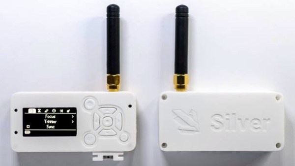
[Foaly] has been hard at work making an open-source long range camera remote, and recently shared a deeply thoughtful post about how it is never too early to consider all aspects of design, lest it cost you in the end. It all started with designing an enclosure for a working prototype, and it led to redesigning the PCB from scratch. That took a lot of guts, and we recommend you make some time to click that link and read up on what he shared. You’ll either learn some valuable tips, or just enjoy nodding sagely as he confirms things you already know. It’s win-win.

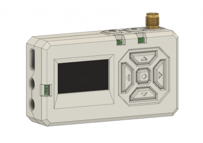
Note the awkward buttons right next to the antenna connector, for example.

The project in question is Silver, and calling it a camera remote is selling it a bit short. In any case, [Foaly] had a perfectly serviceable set of prototypes and needed a small batch of enclosures. So far so normal, but in the process of designing possible solutions, [Foaly] ran into a sure-fire sign that a project is in trouble: problems cropping up everywhere, and in general everything just seeming harder than it should be. Holding the mounting-hole-free PCB securely never seemed quite right. Buttons were awkward to reach, ill-proportioned, and didn’t feel good to use. The OLED screen’s component was physically centered, but the display was off-center which looked wrong no matter how the lines of the bezel were sculpted. The PCB was a tidy rectangle, but the display ended up a bit small and enclosures always looked bulky by the time everything was accounted for. The best effort is shown here, and it just didn’t satisfy.

[Foaly] says the real problem was that he designed the electronics and did the layout while giving someĀ thought (but notĀ much thought) to their eventual integration into a case. This isn’t necessarily a problem for a one-off, but from a product design perspective it led to so many problems that it was better to start over, this time being mindful of how everything integrates right from the start: the layout, the components, the mechanical bits, the assembly, and the ultimate user experience. The end result is wonderful, and we’re delighted [Foaly] took the time to document his findings.

Enclosure design is a big deal and there are many different ways to go about it. For a more unique spin, be sure to check out our how-to make enclosures from the PCBs themselves. For a primer on more traditional enclosure manufacture and design, take a few minutes to familiarize yourself with injection molding.

Life On Contract: Product Development Lessons Big And Small

Developing a product and getting it out there to build a business is really hard. Whether it’s a single person acting alone to push their passion to the public, or a giant corporation with vast resources, everyone has to go through the same basic steps, and everyone needs to screw those steps up in the same way.

The reality is that the whole process needs to involve lots of aspects in order to succeed; small teams fail by not considering or dedicating resources to all of those aspects, and large teams fail by not having enough communication between the teams working on those pieces. But in truth, it’s a balance of many aspects that unlock a chance at a successful product. It’s worth recognizing this balance and seeking it out in your own product development efforts, whether you’re a one-engineer juggernaut or a large, established company.

Continue reading “Life On Contract: Product Development Lessons Big And Small”

The Value Of Cardboard In Product Design

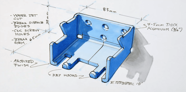
A while ago, [Eric Strebel] created a backpack hanger. The result was great — by just bolting this backpack hanger to the wall, he kept his backpack off the floor and out of the way. There was even a place for him to set his phone to charge. [Eric] is thinking about turning this idea into a product, and just posted a video on his process of making a cardboard mockup.

Since this is a study in industrial design, any mockup will need to keep in mind how the finished article will be constructed. In this case, [Eric] is going to use 4-5mm thick aluminum, cut on a water jet, bent into place, and finally anodized. The finished product will be made out of bent sheet aluminum, so this little bit of product design will use Matboard — a thick, heavy cardboard often used for mounting pictures in frames. The Matboard will substitute for the aluminum, as it is carefully cut, bent, and glued into shape.

The tools for this build are simple, just a hobby knife, razor blade, ruler, and a pen. But there are a few tricks to working with Matboard. To bend these pieces perfectly, [Eric] is painting one side with water. This loosens the fibers in the Matboard, allowing for perfect creases before one layer of the build is glued together.

Once a few layers of this Matboard are glued together, the finished product becomes less like cardboard and more like a very soft wood. This allows [Eric] to use belt sanders and countersink drill bits to give a little bit of polish to this one-off prototype. This finished article works great, and now [Eric] is looking at taking this idea into production.

Continue reading “The Value Of Cardboard In Product Design”