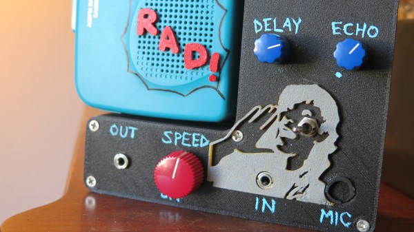
Cassette players and tapes are fertile hacking ground. One reason is that their electromechanical and analog nature provides easy ways to fiddle with their operation. For example, slow down the motor and the playback speed changes accordingly. As long as the head is moving across the tape, sound will be produced. The hacking opportunities are nicely demonstrated by [Lara Grant]’s cassette player mod project.
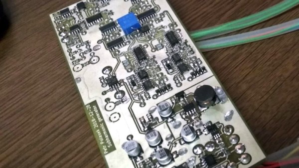
The device piggybacks onto a battery-powered audio cassette player and provides a variety of ways to fiddle with the output, including adjustable echo and delay, and speed control. At the heart of the delay and echo functionality is the PT2399, a part from the late 90s capable of some pretty impressive audio effects (as long as a supporting network of resistors and capacitors are in place, anyway.)
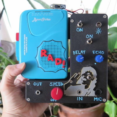 [Lara] provides a schematic for the PT2399’s interface to the cassette player’s output, which is handy should anyone want to try a similar modification. Speed of playback is controlled by adjusting the cassette player’s motor with PWM. Volume control swaps a photocell in place of a rotary volume potentiometer, and additional audio jacks provide flexibility for mixing and matching input and output with other equipment.
You can see it in action in the video embedded below. Intrigued, and want a few more examples of modified tape players? How about a strange sort of cassette synth, or this unique take on a mellotron that uses a whopping 14 modified tape players under the hood? And really out there is the Magnetotron, which consists of a large rotating cylinder with tape loops stuck to it — the magnetic read head is mounted on a wand which the user manually moves across the tapes to create sounds.
Tape players are accessible, hackable things, so remember to drop us a line if you make something neat!
Continue reading “Messing With A Cassette Player Never Sounded So Good”

