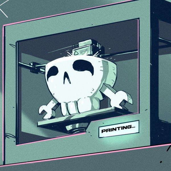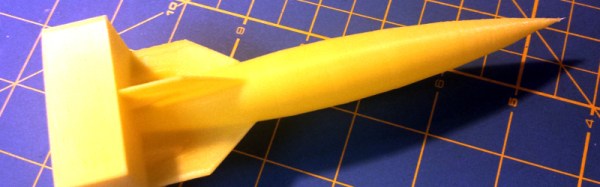
Most 3D printing projects start with a 3D model of some kind. Slicing programs transform the model into gcode. The gcode file contains the commands that actually drive your printer. There are different ways to slice a model and sometimes you want to use more than one on a single model. I’ve been working on a way to make that easier.
When you slice a 3D printing model, you can select different attributes for the resulting gcode file. For example, you might set the slicer to produce different infill density, temperatures, or print speeds. These settings can have a big impact on your printing results. For example, a piece that needs high strength might require a denser infill than some trinket or key chain. You might want an artistic piece to have a finer layer height than some internal part for some gadget no one will ever see.
One Size Fits All?
The problem is that for most open source slicers, these settings will apply to the entire model. Cura has some plugins that can change settings at different Z heights, and Slic3r can vary layer height, but in the general case, what you set for the slicer will apply to the entire model. Of course, a gcode file is nothing more than a text file, so if you are industrious, you can manually merge two or more files into one.
A manual merge is a pain, which is why I wrote gblend. It can stitch together gcode files to get various effects. The program takes multiple gcode files in as inputs and can combine them in different ways. The most useful feature allows you to get a certain number of layers from each source file and combine them into a single print. Measurements are in millimeters, so you don’t have to worry about layer numbers. The entire process is much easier than anything else I’ve come across.
Continue reading “Better 3D Prints By Mixing Slicing Techniques”

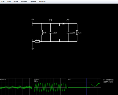 Like the original simulator, this one is great to show a classroom circuits and encourage building or studying circuits in the browser. There’s no extra software to install, which is handy for an impromptu demo. Another cool feature is the visualization of current flow as animated dots. The dots move in the direction of the current flow and the speed of motion is proportional to the amount of current. Watching a capacitor charge with the moving dots is very illustrative. You can also view data in a scope format or hover the mouse over things to read their values.
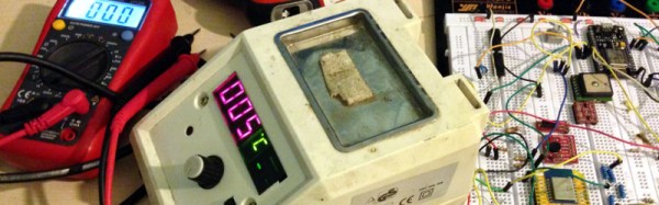
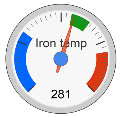 The data pushes out to the Thingspeak server which handles pushing data out to the bigger network, and data representation (like the cool Google gauge in the picture). The best part: [Vegard] gets a phone notification when he accidentally leaves his soldering iron on. How perfect is that?