Shuji Nakamura: The Man Who Gave Us The Blue LED Despite All Odds

With the invention of the first LED featuring a red color, it seemed only a matter of time before LEDs would appear with other colors. Indeed, soon green and other colors joined the LED revolution, but not blue. Although some dim prototypes existed, none of them were practical enough to be considered for commercialization. The subject of a recent [Veritasium] video, the core of the problem was that finding a material with the right bandgap and other desirable properties remained elusive. It was in this situation that at the tail end of the 1980s a young engineer at Nichia in Japan found himself pursuing a solution to this conundrum.

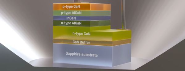
Although Nichia was struggling at the time due to the competition in the semiconductor market, its president was not afraid to take a gamble on a promise, which is why this young engineer – [Shuji Nakamura] – got permission to try his wits at the problem. This included a year long study trip to Florida to learn the ins and outs of a new technology called metalorganic chemical vapor deposition (MOCVD, also metalorganic vapor-phase epitaxy). Once back in Japan, he got access to a new MOCVD machine at Nichia, which he quickly got around to heavily modifying into the now well-known two-flow reactor version which improves the yield.

Continue reading “Shuji Nakamura: The Man Who Gave Us The Blue LED Despite All Odds”

How Different Are SpaceX Thermal Tiles From The Space Shuttle’s?

When SpaceX first showed off the thermal tiles on its Starship spacecraft that should keep it safe when re-entering the Earth’s atmosphere towards the loving embrace of the chopsticks on the launch tower, some similarity to the thermal tiles on NASA’s now retired Space Shuttle Orbiter was hard to miss.

Electron microscope image of the fibrous part of a Starship thermal tile, showing very large fibers. (Credit: Breaking Taps, YouTube)

Yet how similar are they really? That’s what the [Breaking Taps] channel on YouTube sought to find out, using an eBay-purchased chunk of Shuttle thermal tile along with bits of Starship tiles that washed ashore following the explosive end to the vehicle’s first integrated test last year.

To answer the basic question: the SpaceX engineers responsible for the Starship thermal tiles seem to have done their homework. An analysis of not only the structure of the fibrous material, but also the black IR-blocking coating, shows that the Starship tiles are highly reminiscent of the EATB (introduced in 1996) tiles with TUFI (toughened unipiece fibrous insulation) coatings with added molybdenum disilicide, which were used during the last years of the Shuttle program.

TUFI is less fragile than the older RCG (reaction cured glass) coating, but also heavier, which is why few TUFI tiles were used on the Shuttles due to weight concerns. An oddity with the Starship tiles is that they incorporate many very large fibers, which could be by design, or indicative of something else.

Continue reading “How Different Are SpaceX Thermal Tiles From The Space Shuttle’s?”

Inputs Of Interest: The Svalboard Could Be Your Salvation

You know, sometimes dreams really do come true. When I told you about the DataHand keyboard almost four years ago, I never imagined I’d ever get to lay my hands on anything even remotely like it, between the original price point and the fact that they really, really hold their value. But thanks to [Morgan Venable], creator of the Svalboard, I can finally tell you what it’s like to type with your digits directionalized.

If you don’t recall, the DataHand was touted to be a total revolution in typing for RSI sufferers. It debuted in 1993 for a hefty price tag of about $1,500 — pretty far out of reach of the average consumer, but well within the budgets of the IT departments of companies who really wanted to keep their workers working. You want minimum finger travel? It doesn’t get more minimal than this concept of a d-pad plus the regular down action for each finger.

The Svalboard aims to be the new and improved solution for something that barely exists anymore, but still has a devoted following. Although the DataHand was built on a gantry and adjustable using knobs, the smallest fit possible on the thing is still rather big. Conversely, the Svalboard is fully customizable to suit any size hand and fingertip.

Continue reading “Inputs Of Interest: The Svalboard Could Be Your Salvation”

Parts We Miss: The Mains Transformer

About two decades ago there was a quiet revolution in electronics which went unnoticed by many, but which overturned a hundred years of accepted practice. You’d have noticed it if you had a mobile phone, the charger for your Nokia dumbphone around the year 2000 would have been a weighty device, while the one for your feature phone five years later would have been about the same size but relatively light as a feather. The electronics industry abandoned the mains transformer from their wall wart power supplies and other places in favour of the much lighter and efficient switch mode power supply. Small mains transformers which had been ubiquitous in electronics projects for many years, slowly followed suit.

Coils Of Wire, Doing Magic With Electrons

Inside and outside views of Jenny Lists's home made linear power supply from about 1990
This was a state of the art project for a future Hackaday scribe back in 1990.

A transformer works through transferring alternating electrical current into magnetic flux by means of a coil of wire, and then converting the flux back to electric current in a second coil. The flux is channeled through a ferromagnetic transformer core made of iron in the case of a mains transformer, and the ratio of input voltage to output voltage is the same as the turns ratio between the two. They provide a safe isolation between their two sides, and in the case of a mains transformer they often have a voltage regulating function as their core material is selected to saturate should the input voltage become too high. The efficiency of a transformer depends on a range of factors including its core material and the frequency of operation, with transformer size decreasing with frequency as efficiency increases.

When energy efficiency rules were introduced over recent decades they would signal the demise of the mains transformer, as the greater efficiency of a switch-mode supply became the easiest way to achieve the energy savings. In a sense the mains transformer never went away, as it morphed into the small ferrite-cored part running at a higher frequency in the switch-mode circuitry, but it’s fair to say that the iron-cored transformers of old are now a rare sight. Does this matter? It’s time to unpack some of the issues surrounding a small power supply. Continue reading “Parts We Miss: The Mains Transformer”

Have A Ball With This 3D Printed Sphere-Making Machine

Alright, everyone has 30 seconds to get all the jokes out of their system before we proceed with a look at this 3D printed wooden ball polisher.

Ready?

Theoretically, making a sphere out of any material should be easy. All you need to do is pick a point in space inside the material and eliminate everything more than a specified distance from that point. But in practice, sphere-making isn’t quite so simple. The machine [Fraens] presents in the video below is geared more toward the final polish than the initial forming, with a trio of gear motors set 120 degrees apart driving cup-shaped grinding pads.

Constant pressure on the developing sphere is maintained with a clever triangular frame with springs that pre-load the arms and pull them in toward the workpiece, but stop at the desired radius. The three grinding pads are fitted with sandpaper and constantly turn, wearing down the rough piece until it reaches the final diameter. The machine also supports more aggressive tooling, in the form of hole saws that really get to work on the rough blank. Check it out in the video below.

While we appreciate the fact that this is 3D printed, watching the vibrations it has to endure while the blank is still rough, not to mention all the dust and chips it creates, makes us think this machine might not stand up for long. So maybe letting this circular saw jig cut out a rough ball and using this machine for the final polish would be a good idea. Continue reading “Have A Ball With This 3D Printed Sphere-Making Machine”

Sprint: The Mach 10 Magic Missile That Wasn’t Magic Enough

Defending an area against incoming missiles is a difficult task. Missiles are incredibly fast and present a small target. Assuming you know they’re coming, you have to be able to track them accurately if you’re to have any hope of stopping them. Then, you need some kind of wonderous missile of your own that’s fast enough and maneuverable enough to take them out.

It’s a task that at times can seem overwhelmingly impossible. And yet, the devastating consequences of a potential nuclear attack are so great that the US military had a red hot go anyway. In the 1970s, America’s best attempt to thwart incoming Soviet ICBMs led to the development of the Sprint ABM—a missile made up entirely of improbable numbers.

Continue reading “Sprint: The Mach 10 Magic Missile That Wasn’t Magic Enough”

Stepping Inside Art In VR, And The Workflow Behind It

The process of creating something is always chock-full of things to learn, so it’s always a treat when someone takes the time and effort to share it. [Teadrinker] recently published the technique and workflow behind bringing art into VR, which explains exactly how they created a virtual reality art gallery that allows one to step inside paintings, called Art Plunge (free on Steam.)

Extending a painting’s content to fill in the environment is best done by using other works by the same artist.

It walks through not just how to obtain high-resolution images of paintings, but also discusses how to address things like adjusting the dynamic range and color grading to better match the intended VR experience. There is little that is objectively correct in technical terms when it comes to the aesthetic presentation details like brightness and lighting, so guidance on what does and doesn’t work well and how to tailor to the VR experience is useful information.

One thing that is also intriguing is the attention paid to creating a sense of awe for viewers. The quality, the presentation, and even choosing sounds are all important for creating something that not only creates a sense of awe, but does so in a way that preserves and cultivates a relationship between the art and the viewer that strives to stay true to the original. Giving a viewer a sense of presence, after all, can be more than just presenting stereoscopic 3D images or fancy lightfields.

You can get a brief overview of the process in a video below, but if you have the time, we really do recommend reading the whole breakdown.

Continue reading “Stepping Inside Art In VR, And The Workflow Behind It”