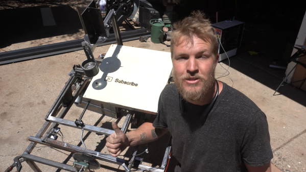
3D printers are built for additive manufacturing. However, at heart, they are really just simple CNC motion platforms, and can be readily repurposed to other tasks. As [Arseniy] demonstrates, it’s not that hard to take a cheap 3D printer and turn it into a viable wood engraver.
The first attempt involved a simple experiment—heating the 3D printer nozzle, and moving it into contact with a piece of wood to see if it could successfully leave a mark. This worked well, producing results very similar to a cheap laser engraving machine. From there, [Arseniy] set about fixing the wood with some simple 3D-printed clamps so it wouldn’t move during more complex burning/engraving tasks. He also figured out a neat trick to simply calibrate the right Z height for wood burning by using the built in calibration routines. Further experiments involved developing a tool for creating quality G-Code for these engraving tasks, and even using the same techniques on leather with great success.
If you need to mark some patterns on wood and you already have a 3D printer, this could be a great way to go. [Arseniy] used it to great effect in the production of a plywood dance pad. We’ve featured some other great engraver builds over the years, too, including this innovative laser-based project. Video after the break.
Continue reading “Cheap 3D Printer Becomes CNC Wood Engraver”